PROJECT
RUNWAY
Snawl's
Season 8
The Final 3 of Season 8

Elysse (LC22)

Zoetic (Slur)

Nate (Pine)
The three of you have had quite the journey to this final task. Some of your journeys were harder than others. But what matters is you're here now. I have never judged finales with track records into consideration, and I'm not starting now. The winner of Season 8 will be the finalist who designs the best collection, period point blank.
In some positive news, you're all "in the money" so to speak. None of you three will leave Snawlterm empty-handed. Regardless of how this finale plays out, you each can officially call yourselves Project Runway LT finalists.
Without further ado, here is your final task. . .
final Task
Collect yourselves, it's Fashion Week!
Your final task of Season 8 is to design a cohesive collection inspired by an original theme that allows you to show off not only your creativity and technical merit as a designer, but also your personality. I want something done by you, that no one else would think to do.
For the first time in Snawlterm history, I am letting the finalists choose the quantity of outfits to feature in their collections. You can choose to submit 4, 5, or 6 outfits. Keep in mind that each number you pick has its own risks and rewards. The more outfits you submit, the wider the chances are of you messing up. However, a flawless 6-piece will always beat a flawless 4-piece. There is no "right or wrong" quantity to choose, so I recommend you think of your idea first before settling on a number.
Here are the standard ground rules for your collections:
-
Any possible pose is allowed
-
Retro items, Fuusio, and glitches are allowed
-
Nothing immersion-breaking is allowed (IE a glitch that detaches your head, etc.)
-
Effects, furni, and any type of photo editing are not allowed
-
The more original your theme is, the better your chances are
-
You must create a name for your collection, as well as a brief description to be presented alongside your outfits at the final panel
-
Your finale outfits must be photographed in pristine quality. If you need help, I will happily photograph you myself
-
You can show prototypes to whomever you want, but do not attempt to ask any of my guest judges for help or advice
The limit for this finale is only your imagination.
Good luck!
Slipping Under by Elysse (LC22)


While I've been primarily inspired by the photos I took in Perth, I've also had a partially finished song I've been writing swirling through my head the whole time as well which is kinda cool.

*click here for Elysse's song and aquarium photographs
First Impressions: When you showed me your Perth Aquarium photos a few weeks ago, my instant thought was that they'd make for a fantastic collection. There is something magical about the concept of making a collection from a real life experience. As someone who lives in a port city and who traverses the Pacific Ocean on a passenger ferry 5 days a week to get to work, this collection touches my heart. I love everything ocean related, and my post-life wish is to be buried at sea. Needless to say, I must restrain myself from biases as best as possible when judging this collection against your fellow competitors'. Looking at this collection, the first thing that grabs my eye is this continued left-to-right sparkle effect you are conveying with the orange, yellow, turquoise, and celestial items. This collection is both started and finished with dense, solid, almost monochrome palettes on heavy gowns. I'm a huge sucker for full circle, "end built into the beginning" type presentations. I can't wait to dive in, pun possibly intended.

Outfit #1: As I mentioned in my first impressions blurb, starting a collection with monochrome - I think - is a really smart thing to do. You've established what your presentation is about, and our first bite is something as deep, dense, lush, and intimidating as oceans themselves. Intentions set aside, I'm not digging this outfit 100%. It's really detailed, both symmetrically and asymmetrically, and I don't quite understand where you were pulling for that type of inspiration. The wings harbouring the bow in between is impressive to look at. When you design in monochrome you need to convey at least one of two things: A) interesting texture or B) interesting silhouette. Your textures are jumbled, and your silhouette is awkward. We're going to see that gown three times in this collection, and this is easily the weakest of the three. Overall it's nice and has charm, but I think you could have done a lot better. This is my least favourite of your six outfits. Not a perfect start, but you certainly can rally back.
Outfit #2: Scientists have predicted that bubbles emerging from the crust of the ocean floor is responsible for seemingly inexplicable sinking of various ships throughout human history. This is because water loses buoyancy when so much bubbles are present, they cause the density of the water to become less than the density of the vessel. This can explain why the River Wharfe in Yorkshire, England is responsible for so many fatal drownings despite looking like an innocent and inviting river. This is what I interpret when I see the white dots on your vest: vicious, roistering bubbles threatening to plummit anything that dares float above. A very gorgeous but frightening allure to this outfit that I'm not sure anyone else will agree with me on, but art is about interpretation. The shoes & earrings only drive my theory further. My only issue with this outfit is the dress/loin rag, I feel it is tonally inconsistent with the rest of the collection which seem to be bundled up to a great degree. Besides that, this is a frighteningly beautiful outfit.


Outfit #3: Simply amazing. Not only is this the most commercial outfit of the lot, but somehow through some genius design magic, it's also the most literal and reminiscent of an aquarium for me. The bright golds at the bottom are stunning and they evoke those LED lights some people put at the bottom of their home aquariums. The light dissipates as it gets closer to the top, and it's capped off with the vermillion bows in your hair (is that hair on Habbo or a retro? If it's on Habbo I'm prepared to pay whatever price for it!). Your use of the butterfly stamp on your upper back is flat-out astonishing because it continues the pattern of the kimono sleeve. The only part of this outfit I'm not completely sold on are the shoes because they look a bit jank, but hey, I'm just glad I can see them under that overwhelimg and ever present gown. Brilliant work on this submission, Elysse!
Outfit #4: Once again we have cool & warm colours harmonizing really well in a way that evokes a shimmering, almost bioluminescent aesthetic. The splotches of colour on the earrings and torso are really pleasant. I'm getting a strong feel of submersion with this outfit, too. It's the blue shade gradient shift around the waist for sure. I enjoy the colour of the shoes a lot too. My biggest issue with this outfit is the corset looking retro item. It's clear why you used it; to break up the autumnal dress for its colour. However I feel like its lack of texture hurts the scope of the outfit, and the triangular pointed cuff clashes with the gentle silkiness of the dress. It's a relatively minor flaw and it doesn't stop me from enjoying this outfit at all, but I know you understand it's the Final 3 of Snawlterm and so I can't afford not to be picky. Otherwise, this is another solid outfit.


Outfit #5: Anyone who knew me from 2016 to 2020 knows turquoise is my favourite colour to design with, and I love pairing it with dark, murky, somber palettes. I also love capes, so I find myself struggling to not be bias by writing this outfit off as a 10/10 and immediately moving to the next one. Respect where it's due, I believe this is a breathtaking outfit and you have to be dishonest to not agree to at least some extent. This exemplifies why I decided to allow retros and generators in Season 8 - you're using the resources sparingly to augment your idea, not supplementing it entirely with mere novel items and colours. The crackles of bright baby blue on the earrings, buckles, & shoes are giving me life, and they work so well against the grainy texture of the '20s gown which has to be one of my all-time favourite uses of it. You delivered another masterpiece, well done!
Outfit #6: If I didn't know better, I would assume this outfit was inspired by some sort of intergalactic space cloud or local supercluster. However because you ingeniously paired it with the previous outfit, it is blended in immaculately with the rest of this collection. That crystal wearable dress (forgot its name) is an item I am often bored and unimpressed by. You cleverly covered it to use only its most protruding points. The space backpack with the celestial cape is such a brilliant combination, and then it's toned spectacularly with the hues on the gown. This outfit is deep, bubbling, chaotic, just like an aquarium. I don't think I understand the green thing on your head - I think the colour works great with the rest of the outfit but I wish you committed to a more prominent, and frankly sensical headpiece. Had you done that, this outfit would feature a far more triumphant colour gradient. Either way this is still a superb outfit, and a great way to finish off this collection.

Conclusion: The collection started on a weak note, but you immediately rallied by outfit #2 and maintained a level of technical elevation & creativity till the end. This collection is a visceral triumph of philosophy evoking imagery, tonalistic colours, and raw human experience. I haven't judged your competitors' collects as of typing this, but if I were either of them and I saw this collection, I would be sweating profusely.
This wraps up your journey of Season 8 - a journey with three task wins and zero bottom 2 appearances. I would tell you to be proud of everything you've done but I already know you are. You have very quickly soared up the ranks to become not only one of the PR community's most active event planners, sought after hosts, and praised designers, but also one of my personal favourite people. Regardless of what happens in this finale, I know these are just the beginning steps in what is destined to be a fun & fruitful companionship of two people united by their love of creativity, community, and generosity. Well done Elysse, and good luck!
FIALKA! by Zoetic (Slur)


The general basis of the collection is deconstructed Russian streetwear inspired by Soviet era political propaganda posters. I really liked the idea and juxtaposition of modern Russian streetwear and old Soviet posters. You see some rather avant-garde deconstructed looks paired with some more ready-to-wear commercial looks. When creating this collection, I was designing to first of all, make art that it true to myself and my aesthetic, but also make some things I could potentially see on a store mannequin, or something that someone would see on the runway and want to buy right away.

*click here to see the propaganda posters
First Impressions: I had way too much fun creating the background for your collection. I used various images, colours, and tones, and almost all of them looked great. Ultimately I settled on muted gray to allow your clothing to stand out best. When clothing looks great under any circumstance, that is a surefire way to know you're looking at something special. I read your description before I saw your outfits and admittedly I was nervous as hell. I've seen streetwear attempted countless times in short-terms and a small handful of times in long-terms, and it seems to have a very low success rate with me. This collection however completely eats away all my worries. This is one of the most effective, realistic, and charming showings of streetwear I've seen in the 13+ years I've spent hosting this game. Perhaps it can also be because I'm a bit of a nerd when it comes to 20th century European history, but this Soviet era Dieselcore-esque concept is actually brilliant, it marries well with streetwear, and I'm surprised no one else has thought of it before. I cannot wait to start judging this collection!

Outfit #1: When this competition is over, you're gonna have to provide us with a step by step walkthrough on how you made this outfit. Everyone is asking me, and I have no idea. Some people even suspect Photoshop - which would get you disqualified. However I know in my heart you didn't cheat, don't worry. As for the outfit itself: It's brilliant, it's a friggin' masterpiece! Complex tartan pattern aside, the interwoven highway of white fabrics on your back is show-stopping. They work in tandem with the bulky shoes to create this homage to intricate concrete structures and statues typically associated with Soviet architecture. Using a dark gray would have been more realistic, but then it would not have contrasted the blue & red as well, so I forgive it. Adding the circular earring to duplicate the circular buckles on the sash and suspenders isn't completely original, I've seen it a small handful of times before. But it's still adding an extra layer of beauty nonetheless. This is an amazing start to the collection!
Outfit #2: This may shock you, but this is my favourite outfit of your six. With a collection as detailed as this, it really really helps to have at least one outfit dialed back significantly on patterns & texture. It shows me you are grounded and you know what you're doing. You haven't lost sight of the streetwear aspect of this theme. I wish there was one more outfit in the collection that was as beautifully subdued as this one, preferably near the end at #5 or #6. Ahh well, I'm just happy with what I get. Similar to your previous outfit, this one gives me obvious allusions to this type of pseudo-Greco-Roman architecture washed heavily with bleak brutalism that Soviet Russia is iconic for. The subtle texture on the top & bottom screams concrete. The white sash cutting diagonally across the chest is eerily beautiful, possibly symbolizing some sort of Big Brother restriction on the populace. This outfit is social commentary, I love it. Two astounding pieces in a row, nicely done Zoetic!


Outfit #3: High fashion Gopnik tracksuit? Yes please! I love it when something so recognizable and iconic is not only conveyed fluidly through pixels, but is then riffed on and made original. I assume you're dance posing so your arm hides the unflattering silhouette of the bag, which if so is very resourceful. However I think I would have preferred to see this outfit from front, and possibly without the bag, too. That being said, you have a gorgeous merriment of red, white, & blue stripes all throughout your canvas and yet it doesn't scream American flag at all. I'm sincerely hoping the technical craftsmanship in these outfits are being appreciated by those who follow this long-term. These outfits look simple but they're actually complex as all hell, and part of what makes this stand so strong is the knowledge of knowing when to hold back, and when enough is enough. Stunning work!
Outfit #4: This is a nice outfit, but it's my least favourite of your six. I'll start with what I love: The pants plus whatever that vermillion thing is, in that specific pose give the impression it's actually a patchy gown. I hope that was intentional because I think it's show-stopping. Everything else about this outfit is good but not really long-term worthy. I've seen countless side poses with that purse and that tartan sash. Granted you don't play short-terms as frequently as most of us so there isn't a whole lot I can fault you for, but at the same time I cannot sit here and pretend to be impressed by something that I'm not. This is one of the very few occasions where I actually think heavier accessorizing would have had a better end result. Maybe a clunky earring or loud scarf, anything really to divert attention from the purse & tartan sash. Ultimately this outfit is still pleasant to look at, it fits in immaculately with the rest of the collection, and is in no way a misfire. It's just a bit too derivative of outfits I've seen from the past. I hope that's a fair criticism.


Outfit #5: It's the fan favourite! Seriously, when I dropped the collections, this outfit had my guest judge chat stirring. And for good reason, I too am an ardent fan! Similarly to outfit #1, you're gonna have to do some sort of tutorial or walkthrough because nobody knows how you achieved this. That two tone + white scarf is criminally underrated in Habbo PR and I've tried many times to get it to catch on, perhaps now people will see its potential. The unorthodox pattern of white underneath the scarf is a really pleasing effect and it separates the other colours well. The rest of the outfit is a very boxy, simple pattern, but it reinforces the stark bleakness of the propaganda posters; that charmless, stern, authoritarian feeling. In a collection of triumphant outfits, this one sticks out as especially magnificent.
Outfit #6: I think I'm enjoying this outfit more than most. Soviet Russia is cold, both metaphorically and literally. This bundled couture beauty looks to me to be some sort of homage to old Yakut winterwear (which could honestly be a task in and of itself) filtered through a contemporary lens. The parka, gown, and head tie are all traditional, but it's the long scarf and intricately placed colours that drive this into the 20th century. I love the creative decision to leave the main bodice white and only add colour to the appendages. Using the wedding dress in such a resourceful way had to have been scary as hell because I've seen it torpedo so many promising outfits. The only tiny part of the outfit I'm not completely sold on is the white head tie, because its vertical off-centre placement is a bit awkward. However I respect the idea to break up the parka's hood. Ultimately this collection could not have finished on a better note. Not only do I love this outfit, I think it's one of the strongest you've submitted in this competition. Well done!

Conclusion: This collection gives icearbr's iconic CorpeTerm submission a run for its money in terms of creating contemporary streetwear that is both original and marketable. Not only did you immediately catch my eye, but you retained it through six daring but different outfits. I had no idea I loved the old Soviet Cold War aesthetic to such a degree, but after judging this, I just wanna waste an hour learning as much as I can about the art style, the people who made the posters, and their impact on the latter half of 20th century Russian media.
You started out at the bottom 2 on the first week and I genuinely, seriously considered eliminating you. Since then however, you've rallied back in a way I've never seen. When looking at your portfolio against any other competitor in this game, I don't think any of them show as much range as you. You cover so many different aesthetics, styles, fabrics, movements, and approaches. You won one task, but your outfits on weeks 4 & 5 are masterpieces that could easily have won as well. Even your average scoring outfits were stunning, like your Seventeen Mag and Francis Bacon submissions. Regardless of how this finale pans out, I want you to know that you defied my expectations by doing what I once thought was impossible: You returned to PR after a near decade long absence, and with just a few months practice in a handful of short-terms, refined your skillset in a way that allowed you to stand toe-to-toe with the best of the community. Nothing can ever take that away from you.
Metropolitan Decay by Nate (Pine)
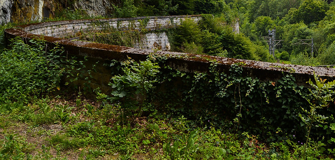

This five-piece collection is inspired by the hypothetical idea of humans suddenly disappearing. I wanted to focus on an urban landscape and look at how neglection towards multi-story buildings could result in an overgrowth of greenery and rust. These five outfits are shown in a progressive order, depicting a lapse of time where the effects have taken place.
.png)
First Impressions: Let's get the elephant out of the room: Your concept of urban decay and the subsequent take-over of foliage is eerily similar to Filip's Ecopunk collection from last season. Granted it's not the same thing as Ecopunk at all, but it bears enough visual resemblance and philosophy to where I immediately noticed it, and several other people have also pointed it out to me. Designing a multi-piece collection is an opportunity to show the community a side of you we haven't seen, it's a window into your creative psyche. To do something that has arguably been done before (and so recently too - last season!) is a bit anti-climactic. That being said however, this is a stupendously beautiful collection that features some gobsmacking detail, brilliant uses of texture, and your time lapse idea is absolutely great. This is you at the best I've seen you, and I had no idea someone so new to competing in Project Runway was even capable of designing such an intricate collection. This soars above & beyond the expectations I laid out for you, and I cannot wait to take a closer look at each individual outfit... so let's do it!

Outfit #1: My God I love this outfit so much. Not only is it unapologetically you, but it summarizes your theme flawlessly. Even without your explanation, I would look at this and immediately think of the dilapidated architecture in a specific level of The Last of Us, Pt. II. This is a shining example of how to use a backwards pose to its greatest effect. You are harvesting the best use of the textures from the jacket, pants, and shoes. These details are so strangely realistic that this could double as a CC outfit. Each section of the outfit has its own vertical lines, and none of them ever quite line up with each other which helps sell the illusion that I'm looking at a summary outfit instead of a specific wall or building. You know what would make this outfit even better though? Absolutely nothing, it's perfect. This is my favourite outfit you've submitted all season. What a way to start a collection!
Outfit #2: While your first outfit evokes the blunt, repeating architecture of a downtown skyrise, this outfit looks more industrial, like the brightwork in a refinery or nuclear powerplant. Every texture on this outfit is not only gorgeous and necessary, but it is further highlighted by the act of posing backwards. I imagine this outfit from the front would be nothing to write home about, but from here it looks astounding. My favourite part is the use of the beef jerky belt which looks like rusted copper piping. My only issue with this outfit is that it doesn't sell your intended illusion of "gradual foliage takeover" because this outfit looks the cleanest and least effected by erosion or scum, less so than your first. This is still a masterwork of texture, technique, and innovative posing and you should nevertheless be proud of this creation.


Outfit #3: This outfit works for the same reasons outfit #1 works. It's sturdy, sleek, it looks like an actual building. The increased erosion with the rust and scum is beautiful. I love the swamp brown on the socks, it's adding so much character and drama. I've always loved that scarf from the side angle pose so I'm happy to finally see it being utilized in a long-term. Your face accessories are cute, couture, and are once again using the side pose to their utmost advantage. I'm glad you were able to look at the shiny glossiness of the raincoat and be inspired to use it to convey structure. I have no criticisms for this outfit. It's a simple silhouette but the meticulous detail is startling. This looks like you spent an hour carefully toiling over the smallest details, items, and colour changes. It paid off, this is amazing. Great work, Nate.
Outfit #4: I'm torn on this one. I'll start with what I love, and that is the colours. Those hues of gutter green and brown are remarkable, I love how the scarf drips down and then the brown on the bow belt forms. This outfit represents the 4th step in the process of falling into decrepitude and disrepair, and you convey it appropriately. What I don't love however are your fabric choices for this piece. It's mainly the kimono top which is only one item, but it's large and prominent enough to hijack the tone of the whole outfit. It's really loose and baggy, which doesn't ring loyal to your first three outfits, all of which had more solid appearing silhouettes. The looseness of this outfit's shape actually makes me think of an overstuffed, leaking garbage bag far more than a structure losing its integrity. It's a neat outfit on its own, but I feel it's disjointed from everything else you've shown thus far.


Outfit #5: For me, this is a far better example of post-apocalyptic buildings at the mercy of nature than your previous outfit. This is beautiful in its destruction; I love how you fully embraced the mayhem and went all out. I find the face paint to be jarring, but I understand its application. The top half of this outfit is a stunning concoction of colour and texture, I love the decision to add a tiny bit of pitch black because it extends the scope of the outfit and makes it seem bigger and more deep than it is. That necklace fits your theme perfectly so I'm happy to see you using it. As my eye travels lower, I am captured by textural components that I've never seen before on pixel clothing, yet they are added tastefully so to not rob attention from the outfit's construction, nor are you trying to capitalize on sheer novelty of new items & textures. The only thing I would attempt to change about this outfit are the shoes - I'm just not a fan of pairing a gown with huge rainboots. Besides that, this is another successful outfit that conveys your theme nicely, and the final step in your chain of chaotic beauty. Bravo.
Conclusion: I love rot, scum, decay, building degradation, etc. I also love greens & browns in murky colour palettes. This collection was right up my alley and I am very grateful it was presented here in Snawlterm so it can be properly appreciated. I understand and support your decision to use 5 outfits instead of 6 because your outfits convey an interwoven theme of gradual decay. As much as I love this theme and your subsequent execution, I must also say what I said above, it is a bit underwhelming to see you submit a collection whose theme and colour palette are sharing so many similarities with another Snawlterm collection. That being said however, there are elements to this collection that are irrevocably original.
Your journey throughout Season 8 of Snawlterm was a wild one filled with many ups & downs. You have no clue how close I was to eliminating you on Week 3, in fact I had it made up in my mind that you were going that week until I ultimately changed my mind and spared you. Clearly you made the most of your 2nd chance, because here you are in the final 3 with a truly remarkable 5-piece collection. Throughout this competition, you paid very mindful attention to fabrics and shapes which ensured that your outfits, regardless of how they were received at panel, always made sense and were practical. I made the decision to reach out to you about this long-term because I remember you designing a simple but stunning outfit in one of my short-terms, and I wanted to see more of your eye for detail and your innate genius when it comes to matching fabrics with one another. You gave me what I wanted, because your portfolio this season is stunning. Regardless of where you land in this final placement, I hope you are proud of all the odds you circumvented, and the gorgeous pieces you submitted. Thank you, Nate!
Finale Conclusion
Congratulations to the three of you, you each have submitted show-stopping collections that are making my job as a host extremely difficult. Because of the quality of these collection, I have decided to increase the 2nd & 3rd place prizes by +50c. The final prize roster is as follows:
1st place - 300 coins
2nd place - 150 coins
3rd place - 100 coins
This is something I am truly happy to implement, you guys deserve it. I wish I had the funds to give you all more.
Without further ado, it's time to reveal the placements for the final three of Snawlterm Season 8...
The contestant finishing in 3rd place is. . . . . .
*Highlight text to reveal
-- Nate (Pine) --
Oh Nate... Your collection was so good, I genuinely considered erasing 3rd place entirely and instead tying you with the person who finished 2nd. Ultimately the factor that leads me to this decision is less to do with what you made, and more to do with what your fellow competitors made. I feel like Elysse & Zoetic simply brought it harder. They started with a more original concept, and they featured designs that dazzled me just a tad more.
Regardless, you definitely brought your A-game this finale, and you should feel proud of having given those two such an intense run of their money. Congratulations on an unforgettable collection and a mesmerizing portfolio.
And just like that, we are down to two...
Two incredible designers with incredible collections. I could very easily make a case for either of you winning. Sadly we don't do ties in these competitions.
I have made my decision, and here it is...
The winner of Snawlterm Season 8 is . . . . .
*Highlight text to reveal
-- Zoetic (Slur --
Congratulations, ZOETIC! You have transcended 13 phenomenal designers and have emerged victorious! You are officially a Snawlterm champion!
Well done, amazing work.
Elysse (LC22)... It was so, so close, you have no idea. Ultimately my decision to settle on Zoetic as the winner stems from my belief that his collection shows more ways his theme can be interpreted, while still remaining cohesive. Although you edged him out in a few ways, it was his unrestrained range that helped him take the cake. Nevertheless, Slipping Under is a phenomenal work of art that I thoroughly enjoyed looking at, and I have no doubt I'll continue to enjoy it for years to come. You have every right to be beaming with pride for all of your hard work.
That's a wrap for Season 8!
"Will you host a 9th season?"
Possibly, sure. I don't see why not. I have no shortage of interesting task ideas I would love to see come to life. Also, this season was particularly stress-free to host because I did a lot of legwork prior to launch. I can definitely see myself doing it all again for another great season!
However, it also depends on the community. I'm not a fan of merely casting the same people over & over again. For me to host a 9th season, there would need to be enough "fresh faces" in the community to justify a season. At the bare minimum I would like 50% of my cast to be newcomers to LTs, much like this one was.
I suppose only time will tell, so stay frosty, and stay involved in the community! Host short-terms, invite friends who you believe would enjoy PR and thrive in its intense environment! We'll see.... ;)
1st Place: 300c
2nd Place: 100c
3rd Place: 50c
4th & Below : Jack Shit

The competition is stiffer. . .
The tasks are harder. . .
The host is more mentally unhinged than ever. . .
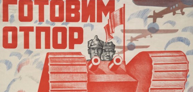
This is. . . Snawlterm Project Runway Season 8!
Artwork courtesy of icearbr
Snawlterm Season 8 is mobile friendly!