
PROJECT
RUNWAY
Snawl's
Season 8

Task #6
Bringin' Home the Bacon
Throughout the middle of the 20th century, British painter Francis Bacon remained one of the loudest painters in the UK - both in terms of popularity as well as style.
He was a strange individual who painted even stranger artwork. Although he did not usually imbue his art with deep meanings, he certainly did have re-occurring themes. His graphic violence and unapologetic focus on mature subject matter helped kickstart the contemporary art movement. (He was one of the main inspirations for Zdzisław Beksiński - my single favourite painter of all time.)
His legacy permeates today. Despite always receiving criticism and ire from those who resent his crass paintings, his work continues to shatter bidding records at art auctions, and are sought after by many celebrities. And although he's far from being my personal favourite, his work is deeply inspiring, his legacy is undeniable, and his name deserves to be learned.
For your task this week, you must pick one of Bacon's paintings and design an outfit inspired by it. He has over 325 confirmed & preserved artworks, so there's plenty to choose from. Once again I urge you to follow your heart and to choose whichever painting speaks to your artistic abilities the clearest.
Below I have listed some of his most popular works, but you can click here to be taken to his WikiArt page which has good quality images of all 325 artworks.
*Please note that you must provide the name and year of the painting you choose. Some of his paintings share the same name, so providing the year will help me to find the correct one that inspired your outfit. Your chosen painting will be displayed alongside your outfit.
Good luck!
Oh I almost forgot: NO OUTFIT ADVICE THIS WEEK. That's right, we've reached the part of the competition where I must slowly wane the cast off outfit advice to ensure you gain full creative autonomy by the semi-finals. You can still ask questions regarding the task, just nothing pertaining to the outfit you submit.
Panel
Final eight. After tonight's elimination, we are going to be left with the top 50% of the original cast!
I've emphasized this before but it's worth repeating: The intense level of talent in this cast is so high that these eliminations are not indicative of talent, but more or less indicative of luck & circumstance. Every single one of you has just as much of a chance at losing this week as you do of winning. Certain designers excel in certain tasks, and of course there are outside components like mood, nutrition, fatigue, stress, and time that all have minor but real impacts on one's ability to create. What I'm saying is, don't get yourself down if you're not scoring as high as you want to. Also don't turn your nose in the air at someone who loses before you. The smallest change could very well reverse any task's outcome.
Your guest judge for this week is Arber (icearbr).
Let's get a move on.
It's time to see which contestants' artwork is made famous by getting smuggled under a thief's jacket, and who gets donated to a charity auction.


fupaqueen
(Elise)
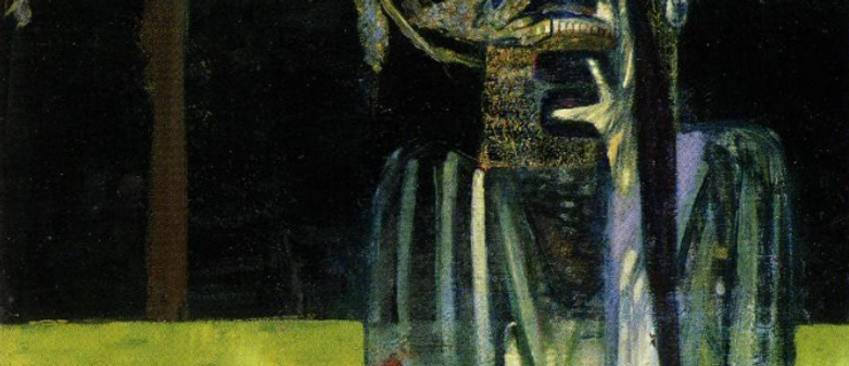
Figure with Meat (1954)

.png)
Snawl: Compressing all of the chaotic energy of this single painting into a Habbo outfit is a tall order to fill, so I understand and respect your decision to focus specifically on the cow carcass. What I absolutely love about this outfit is that you picked fabrics that allow you to mess with the shades of colour. The two-tone gown and your sleek, subtle build-up of purple along the trim and buttons, the shade transition on the cape, it’s well conceived. The shoes look like hoofs, amazing. The minimal but impactful gore on the chest and the exposed bone borders on costume, in fact I can’t imagine this outfit feeling out of place if it were in a CC. However I can’t fault you too much because this is a runway outfit. I could see it stomping down the catwalk in a moody, dimly lit warehouse filled by a bunch of pretentious art snobs who gathered together to commemorate F. Bacon. Overall you did a great job this week, welcome back.
icearbr: A spectacular presentation of the painting with a piece that didn't reinvent the wheel🎡, just enhanced it with super specific editing and use palette🩸. The use of hair👩🦱 here adds so much to the outfit👗 by hiding and dividing specific parts of it and enhancing the shape of the overall composition. I do wish you didn’t use these specific eyes because it brings the outfit into cc🤢 territory. Overall greatness.


Pine
(Nate)
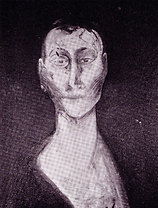
Study after Velazquez's Portrait of Pope Innocent X (1953)
Snawl: I re-wrote my critique for this outfit because in my original write-up I whined about how you didn't feature the prominent vertical brush strokes anywhere on your outfit. However, nowhere in the task's briefing did I say the outfit needed to be a direct companion, I only said it needed to be "inspired by" the painting. Upon reflection, I've done a 180 and I think this is your best outfit yet. Like last week, it's a simple but stunning piece that plays with negative space and sleek textures. Unlike last week however, this is very wearable. It's like if Bacon fell on hard times and had to get a job designing streetwear for Off-White or WTAPS. Baggy pants draping over the runners while you stash little nuggets of yellow around the canvas, it's a really splendid outfit. Also props to you for making the gun holster look nothing like a gun holster. Great work this week, Nate!
icearbr: One of my favourites of the week. You took the painting then reproduced it into your very own personal design👳 with this sleek urban shiny baggy realness🤰. The strategic placement of the yellows🧈 further elevates this look.I wouldn't change a thing. Greatest of jobestest this weekestestestest.


Slur
(Zoetic)
Study Figure I (1946)
Snawl: There are so many positive things I wanna say about this outfit. I love how you’re commemorating almost every detail of your painting without cluttering the outfit; every component looks planned out thoroughly and there is nothing I would remove for clarity. The scheme of the gown being almost extended by the handbag is brilliant. The deeper red on the shoes is really nice. I find it interesting how the orange is only used as a perimeter for the gray, was that a conscious decision? If so, bravo. Unfortunately I do have an issue with this outfit, and it is of moderate importance. This outfit looks fairly similar to something you've made in the past. Now obviously I'm a sociopathic, obsessive autist - I'm an outlier and I of course do not expect everyone else to have the same memory bank of Habbo outfits that I do. However, in a long-term, you should be a bit more careful. This is still a beautiful outfit that utterly kills this task so it's not like you're in elimination waters or anything. But I am watching you closely. Good luck.
icearbr: This outfit doth theem familiar 🤔. The presentation👀 of the painting is done quite nicely, especially with the way the blue and gold flecks fly from leg🦵 to tit🥵💦. The palette is a bit muted for my taste and I would’ve loved to see more sleek shiny blacks instead of matte gray. Overall an ok job, leaving me wanting more.


EagerGamin
(Marq)
Landscape after Van Gogh (1952)
Snawl: Your creativity in this competition has been unrestrained, but finally you have tapered said creativity for the runway. This is amazing. You noted the undertone of sadness in this artwork's name and desolate landscape, and you rode that into the sunset. This outfit looks arid, splitting, dehydrated, just like dead grass in a neglected field. Your choice to ignore the blue and focus on the ground was a minor disappointment for me because navy blue goes so brilliantly well with pastel browns & cremes, but if anything, the fact that you didn't need it to convey the painting so effectively just amplifies your artistic abilities. The only part of this outfit I don't totally love are the shoes which look like palmate feet on a duck or goose - but I love that you coloured them pitch black. This is a surprisingly resourceful outfit that had a story to tell, and used its subject appropriately. If you keep designing like this, you'll make it to the end. Great work, Marq!
icearbr: One of my favourites this week. You went the opposite way of cozzie change and gave us a representation of the emotion😰 the painting emits with a spectacular outfit. Some might say you could have added bits of blue👮 to fully bring it in but I personally love this the way it is. Keep up at upping the keeping the up🐌.


Okeefinoke
(Max)
Self-Portrait (1972)
Snawl: It's really interesting how this outfit manages to be so loyal to the portrait without completely duplicating the colours. I've been silently waiting for someone to pull out that Eskimo coat glitch and this was definitely well used. The wristbands, scarf, and facial chops all lend credence to this drooping, sagging, toppling effect. You look like a top heavy wedding cake about to fall over, and I mean that in a very positive way! As for feedback, I think the higher pair of sunglasses air on the goofy side. I also would have liked to see more variety with the shades you used. The burgundy & gold are gorgeous but they're a bit too strong for my taste. Had some of the sections been toned even just one shade darker, I think this would look even more grand. Besides that, this is a gorgeous outfit that used easily one of the more difficult paintings in Francis Bacon's repertoire to work with. Please maintain this level of technicality.
icearbr: Wow I didn’t realize habbo user: .uhu🤢 commissioned an outfit! This is also one of my favourites of the week. You kept true to the essence of the art piece by giving us this fat and shapeless, distorted, tubey, rounded up outfit in a spectacular palette. Frankly you have the best🎨 colour🎨 palette🎨 of the week. Ok bye.


LC22
(Elysse)
Study for Portrait V (1953)
Snawl: Envisioning this week's eventual submissions in my head, this outfit was not something I had imagined... and because of that I must applaud your daringness. I really love the heart icon being used to break apart the top and create a new graphic; that is a very underused technique that I believe more people should catch onto. I also like how the smooth, darker black seems to pay homage to the top & bottom borders of the painting which also transition to a smoother, darker black. That being said, this outfit has several components that just simply aren't working for me. The lone jacket sleeve is cute but it detaches from the outfit. The decision to colour the entire skirt gold robs magic from the sparse sparkles of gold up top. The entire look comes across as a bit too textured, whereas the portrait, to me, is more smoothed over. You chose a very difficult painting and I don't think it paid off, sorry Elysse.
icearbr: An interesting asymmetrical🤪 take on the chosen painting. The outfit composition follows the flow🌊 of the art piece quite well visually. I feel like this outfit needs something more, maybe some sort of headpiece🎃 creation that keeps true to the flow, idk. I also think a harsher yellow🟡 could’ve worked better than mustard yellow🍛.


Peyton125
(Peyton)
Painting (1946)
Snawl: You didn't mention this upon submitting, but I believe this outfit was inspired entirely by the lower area of the painting - carpet, bones, and whatever hellscape mess F. Bacon had goin' on down there. In that regard I think you did your subject matter justice. I like how you have several "bony" textures in this outfit, most specifically the cyberpunk wings and how you let the bright lights in the centre convey ribs. I also enjoy that necklace from behind a lot. Sadly, I feel this outfit falls down the totem pole when compared to your competitors this week. It's beautiful in its own right, but is it Season 8 worthy? That's what I'm left wondering. At this point in long-term history, we've seen the cyberpunk wings from behind more often than from front. There is no clever shape or silhouette being used to augment this outfit, it's just a bony outfit with good colour mixing. This isn't the first time I've mentioned this to you, either. You need to let go of inhibitions and design with the same confidence I've observed you design with in short-terms. Thanks, Peyton.
icearbr: Hmm. 🎨Palette🎨 wise, I absolutely adore. Outfitwise, it feels a bit… outdated. We’ve seen this combination done when those wings came out. I do adore the 🦐shrimps🦐 on your head but yeah I see a lack of vision with this one. 🍋Soury~*`
.png)
gnge
(Lee)
Study Figure I (1946)
Snawl: One thing I always find myself thinking when you submit is that I can never truly predict what I'm gonna get from you. You simply think of things no one else does. You consider the possibilities others dismiss. It is because of this out-of-the-box creative process that you've been able to submit some truly mind-bending works of art. This week is clearly no exception. It takes some balls to ignore the dominant colours of a portrait and focus on the fringe to convey what you need. The beard-on-bush action you have happening is pretty enticing. The entire bottom half of this outfit is splendid. I love the choppy, inconsistent ombre effect. That fade shirt with that skirt is a classic effect I'll simply never grow tired of. My biggest issue with this outfit isn't necessarily the outfit itself, it's the Fuusio head glitch. The direction of your head doesn't match your legs & feet, and for me personally, the immersion is totally ruined. For others it may not be, but I can't see past it. Otherwise this is a pretty fresh take on the task.
icearbr: Woah, a neat combination of clothing items! I can see the vision you were going for with the painting, and I like the decision to combine that colour🗿 with your secondary colour🗿. This combination of outfit items is very neat, it’s giving me: habbo outfit combination done in one or more colours🗿! Keep up the outfit making work.
Panel Conclusion
Babe Ruth didn't hit a homerun every game. This week produced some astounding outfits, but the overall quality doesn't measure up to weeks 3, 4, or 5. That's okay, I wanted this task to be tough on you all. Congratulations to Nate (Pine) for winning your first task! Well done to Marq (EagerGamin) & Max (Okeefinokee) who did good enough to occupy the Top 3.
The Bottom Three
Elysse (LC22) - Your outfit this week came with some hefty risks which I appreciate. Sadly, most of them simply didn't pay off.
Peyton (Peyton125) - You submitted a really striking outfit that I could see getting Top 3 if this were a short-term. However this is Snawlterm Season 8. You are having difficulties keeping up with everyone else.
Lee (gnge) - For the second time in this competition you are late, this time by almost 11 hours. I fully believe you when you say you want to be here, however this pattern of behavior is unfair to the rest.
. . . . .The person I am eliminating is . . . . .
*Highlight text to reveal
Lee (gnge). I wish I could say this was a hard decision but it was not. What you possess in blatant talent & creativity, you lack in time management. Regardless, your run in this competition has been truly stellar. A win, several tops, even your bottom outfit last week was incredible. Under different circumstances you very possibly could have won it all. It sounds a bit twisted, but this elimination is my way of accepting your apology. I 100% believe you when you say you are sorry and that you really want to be here. If I were to keep you, I don't know if I trust myself enough to get over the lateness and judge your outfits fairly in future panels. So to preserve our friendship and erase any tension, Lee, I forgive you. Thank you for choosing Snawlterm Season 8 to showcase your talents. You will be missed dearly by all of us.
Congratulations, final seven! You are the top 50%. I am very happy with the individual journeys you each have taken, and I cannot wait to see what each of you do with your next task. Good luck!
1st Place: 300c
2nd Place: 100c
3rd Place: 50c
4th & Below : Jack Shit

The competition is stiffer. . .
The tasks are harder. . .
The host is more mentally unhinged than ever. . .
This is. . . Snawlterm Project Runway Season 8!
Artwork courtesy of icearbr
Snawlterm Season 8 is mobile friendly!