
PROJECT
RUNWAY
Snawl's
Season 8

Task #8
The Land of Ice, & Everything Nice!
Hello final 6, I hope you're all enjoying Iceland and finding it as enchanting as I do.
I say without a drop of hyperbole that Iceland is, for me, the most gorgeous place on Earth. I love it so much, I believe its beauty is best enjoyed at its most natural, without any bells or whistles. This is the inspiration for your next task.
For your 8th task, you must design an outfit inspired by an Iceland landscape photograph! This photograph can be of anything so long as it's of rural Iceland. Beaches, mountains, skylines, forests, orchards, fjords, rivers, lakes, grass plains, waterfalls, volcanoes, glaciers, caves, grottos, rock formations, islands, roads, even rural buildings can all be subjects in the photo you choose. When you submit your outfit, you must submit the photo that inspires it. You must also provide the photo's source (where you found it). This is so I can A) credit the photographer, and B) verify that it is indeed of Iceland and not another Nordic country with similar geography (Norway, Sweden, and the Faroe Islands can easily be mistaken for Iceland).
A rather simple task, but I am looking for details. Anyone can throw on a green dress and say they're a meadow. I want to see your photo's fingerprint on your outfit. I want to see you get resourceful with textures.
Good luck, final 6!

Panel
Judging by these submissions, I think I've successfully made Iceland lovers out of the six of you! It's interesting how all six submissions are inspired by such diverse photos; no two people settled on similar images with similar palettes. Bravo!
Because we're at the final six, I have to up the ante. If it seems like I am less forgiving in future panels starting now - it's because I am. We're at the stage in the competition where you all really don't need me touting your skills anymore. No more clemency, no more good faith critiques, no more "Oh I totally see where you were going with this" type soft handling. Each of you have been put through the ringer more than once, nobody is ahead of anyone else. Push yourselves, bring creativity, convey it appropriately, or get eliminated.
Filip is back - apparently Swedes can just stroll into Iceland without a passport (it's true, look it up!).
After you, Filip.
It's time to see whose outfits can stand up to National Geographic, and who ends up buried in a cheap coffee table magazine at the dentist's office.
Elise (fupaqueen)
subject: Northern Lights
photographed by: Bragi Kort


Snawl: I think I probably like this outfit more than most. The fishnets are texturally very interesting and the upside down triangle in the body is a neat way of slicing up the canvas. I'm glad I am not the only person who knows those visors fit into that headpiece like two puzzle pieces. My biggest issue with this outfit is the excessive black. It may not seem excessive at first glance, but this was a task about conveying the subtlety of the subject matter into an outfit. The photo you chose arguably has no black at all, so for you to use so much just seems like a massive misfire. This outfit, for this particular photo, needs a lot more colour for my money. Ultimately this is an interesting outfit that does a great job at the EDM rave theme you evidently were going for, but as for a companion piece to a photo of the Northern Lights, I am left wanting far more. Thanks.
Lidl-Wayne: The idea here is so funny and clever, and the aesthetic on display is unexpected and thus fresh. The execution is great in several ways - and yet it falls flat. To go for an Icelandic EDM-rave vibe is hilarious and charming and the type of initiative that I love seeing on Project Runway. I especially love the sneaky pink (purple?) details and the dark blue panels that go from the shoulders and down the arms. That is damn chic. The choice of shoes is also quite ballsy. The big issue is that while there are creative elements to this, the base is just a black dress, club-attire for the girl who just wants to play it safe in the style department on her night out. The base thus comes across as very basic and unimaginative. It's like when you get a taste of a new icecream flavour and the first second has a really interesting taste, and then nothing. That's the best metaphor I can come up with right now.


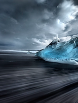
Nate (Pine)
subject: Diamond Beach
photographed by: Reddit user u/Sarahpdx
Snawl: A very peculiar but smart approach to the task, and of course it's Nate of all people who manages to make ice crystals on a black beach look commercial. The only aspect of this outfit I dislike is the hat, but I have a blood feud with berets so that's hardly your fault. I love the subtle black-to-lesser-black with the top and scarf. The entire bottom half of this outfit is flawless, from the rugged pants to the belt + shoes. The photo features sharp, protruding textures, and I definitely get that from several aspects of this outfit. Perhaps you could have used the cross-shaped earrings to hammer home a little more of a "crystallization" effect. Besides that, this is a gorgeous outfit that leaves me all the more confident that your spot in the Top 6 was well deserved. Great work once again!
Lidl-Wayne: This is hilarious and I'm not sure why. It looks like one of those Sex and the City episodes where Carrie has gone out on some romantic escapade and comes home pissed off and soaked in rain. I kind of love this. I'm not sure if I'd call this urban streetwear, but it's some form of streetwear. Icelandic high-end going-to-work-chic? It's like this girl is both a consumer at Diesel/Levi's and Louis Vuitton (or something preppy like that). The frazzled and worn-out textures and colors combined with a more upscale vibe is quite interesting, it's like some super rich character in Gossip Girl (not that I watch it) listened to Paramore or Evanescence for the first time and is now going to REBEL! No more low-fat milk at Starbucks for her! I know I make a lot of fun of your design but I think that's the greatest strength here - it's a look that engages and intrigues. Does it reflect the picture you chose? Eh, idk.


Zoetic (Slur)
subject: Reykjanes Peninsula
photographed by: Chris Burkard
Snawl: This is a stunning outfit, there are elements that I really, really appreciate. The way the cross-cross pattern on the left side of your vest almost mimics the veins of goopy magma is stellar - I feel like that detail will go unnoticed by most. This is also one of the more appropriate uses of the flaming pants I've seen. When conveying rock, there really is no better option for footwear than sturdy, heavy heels or boots. Then lastly, the way the butterfly icon reflects the two background colours is so menial, yet so beautiful. All positive things said however, this outfit is far from perfect. First off, less is more; lose the headband and the fuzzy purple sleeve. Secondly, I feel like the necklace adds nothing, and that entire region was sort of unused potential. I know I just finished saying less is more, but perhaps you could have used the backwards pose to your advantage by discovering a new pattern with a necklace or scarf that would better convey the lava effects. All in all a very visually striking outfit, however I wish it was better polished and had a bigger spectacle. Sound work.
Lidl-Wayne: Trend alert! Pants on fire. It looks so damn unfinished. I say that on the basis that more or less every longterm designer in recent times have played around with Fuusio and had the model wear exactly this, while the designer is confusedly trying to think of where to take it next in order to create a fully realized, original look. That's the problem: there is absolutely nothing original about this. The best thing about this design is that the color palette, which features baby blue and different shades of orange and purple, is interesting. There's creative undertones to it for sure and I can see the concept: a nature phenomenon that is messy and chaotic and yet beautiful. You didn't fully achieve that: it all feels very stiff somehow. You're depicting lava flowing out of what looks like a volcano: I'd say the route to take here would've been to have utilized something that portrayed motion or energy, and not through textural choices.
Elysse (LC22)
subject: unknown glacier
photographed by: Robert Juvet


Snawl: She wore bluuueeeee velvet. Need some extra marshmallows for your camp, Elysse!? Nah I joke, this is phenomenal. That curtain from the sword accessory is something you have experimented with several times here & there, but this is where you seem to have really perfected its usage. I love how you are playing into the darker tones on the shoulder pad, and then reinforcing it with the back accessories. The array of blues is like I'm unwrapping a gift with my eyes. It's a bit labour intensive, but every succeeding second amplifies the joy. I think going completely monochrome with this was the way to go; forcing excess colour into an outfit with so much layering would only make the camp go too far into the realm of costume or RPDR. My only (very minor) criticism would be to add just a small dash of light blue, possibly somewhere in one of the underlayers just to give this outfit the same frigid, desolate, timeless tone the ice in the photo gives. Excellent work!
Lidl-Wayne: I have so many positive things to say about this look so I'll start with the one negative: the hair. It's nice in itself, but this is a super heavy gown, so the messy hair does nothing to balance that out: a more simple hairstyle or preferably no hair at all would've made for a more structured illusion. The picture takes my breath away and it induces feelings in me, I believe the rich layers on your gown were a clever way to portray the landscape. I love that it almost looks like water flowing out of ice, it paid off that you played around with different kinds of blue. The smartest, and perhaps sneakiest, aspect is that your design portrays the movement aspect which can be found in the picture as well: the dancing northern lights - so your depiction isn't too obvious, which I applaud. I knew which designer this was as soon as I saw it: you have a distinct style, and that is something money can't buy. If anything, I just feel like the different shades of pale blue in the picture are a little more interesting than the blues you chose, which are a bit more classic and to-the-point, in this instance I would've liked to have seen you replicate the colors in the picture. Overall: fantastic, impressive work from you.


Peyton (Peyton125)
subject: Seljalandsfoss
photographed by: Jared Warren
Snawl: Both this photograph and your outfit are stunning, but only by themselves. When paired together like this, I can't help but notice a strong disconnect. You're using the same colours, but I don't get that hazy, ethereal, dreamlike fantasia I get more prominently from your photo. One is picturesque and hyper-realism, and the other looks like an anime character. A very friggin' well dressed, fashion-forward anime character, that is! This is honestly one of my favourite outfits from you. I love the use of the baby blue and the shiny brown, I feel like you really took the criticism I gave you last week and applied it thoroughly here. You have a beautiful balance of bright and tame. The sharp textures and uninterrupted lines on your top half actually work in your favour for the outfit's general aesthetic. Sadly though, relation of texture from the photo onto the outfit was a big factor at this week's panel, and for you I feel like that component was largely ignored.
Lidl-Wayne: There's movement in the picture, a distinct energy flow. It's powerful yet serene, optimistic and yet a bit mystical. It made me want to listen to Orbital - Halcyon On and On. I can see the energy flow mirrored in your design, there's a lot of elements to it but it doesn't feel messy, it has that forceful aura to it which is also evident in the picture. I think the use of the fire pants is quite charming and almost fashion-comedy, as a sunrise or a sunset it sometimes refered to as fire in the sky. The clunky, brown shoes were a great choice because they add that earthy tone to your look. Your issue is the styling. I love risk-taking, but the mask serves absolutely no purpose, it's like white noise or an annoying mosquito to what is an interesting design. Besides that, I dig this.


Max (Okeefinokee)
subject: Vatnajokull National Park (aerial)
photographed by: Aron Tómas
Snawl: You selected my favourite photo of the week, then proceeded to do it justice! I'll admit, I wasn't a huge fan of this outfit at first. But after chewing on it for a day and a half, I now think it's one of your strongest to date. I personally would have used more yellow and perhaps some gold, but I think the genius of this outfit is the fact that you didn't need copious amounts of colour to convey the photo. Texture was a huge factor this week, and you achieved it greatly by using that fur accessory which brilliantly replicates the sandy shoreline and swirls of grays. That necklace with the wrestling belt is a match made in heaven, I can't get over it. The flames are gorgeous, the outward flare of the dress is gorgeous, the shoes are show-stopping. The only part(s) I don't like are the seemingly random particles of colour. The red/orange behind the necklace and the pink on your shoulder - sure they're small details, but they're significant enough to break my immersion. Besides that, you killed this week. Excellent work, Max.
Lidl-Wayne: Brilliant! It's a sort of chaotic mischievousness made into a beautiful dress. I'd say the choice of shoes is the best one we've seen all season, the heels are stealing the show here. It's so damn effective and chic. In the Habbo universe, it's quite challenging to create a dress that feels fresh, original and yet not overdesigned- so much has already been done - for me you tick all three boxes. What makes this nature-inspired dress feel so high-end is the rich variation of textures, the eyes get a little taste sample of each different texture, but it's more a process of teasing the viewer rather than offering a full meal. Your design relates to the chosen picture well because it wasn't about exactly replicating everything in detail, for you it seems to have been more about the inspiration and applying your own aesthetic as a designer.
Panel Conclusion
Well done, final 6! I am very happy with the quality of outfits being offered up by my black jacket recipients. Sadly though, the time has come for me to collect one. Before I do that, congratulations to Elysse (LC22) for winning this week, and well done to Nate (Pine) who also finished in the top. Picking a Top 2 was challenging because the top four each could have justifiably won the round.
The Bottom Two
Elise (fupaqueen) & Peyton (Peyton125) - The two of you find yourselves in identical scenarios: You both designed beautiful outfits, but sadly, I feel as if there was a disconnect between your finished products and your chosen photos.
. . . . .The person I am eliminating is . . . . .
*Highlight text to reveal
Peyton (Peyton125). Despite designing one of your stronger outfits of the competition, the end result didn't memorialize your chosen photograph as much as I would have liked it to. This is the deciding factor that is leading me to eliminate you at 6th place, and collect your black jacket. Before I do that, I want to applaud you for everything you have achieved in this game. You came a long, long way, and fought against some very challenging odds. Despite walking in here with some of the least experience, you held your own and outlasted some titans of fashion... and you did it all on mobile, bless. Thank you so much for choosing Snawlterm to showcase your talents. I truly cannot wait to host my next short-term so I can see what you do next.
The Final Five, well done! Your 9th task is uploaded and ready to go. Keep in mind, we are only two more eliminations away from the finale. You have a 60% chance of landing a spot, so perhaps it's a good time to begin thinking of your collection...
1st Place: 300c
2nd Place: 100c
3rd Place: 50c
4th & Below : Jack Shit

The competition is stiffer. . .
The tasks are harder. . .
The host is more mentally unhinged than ever. . .
This is. . . Snawlterm Project Runway Season 8!
Artwork courtesy of icearbr
Snawlterm Season 8 is mobile friendly!