PROJECT
RUNWAY
Snawl's
Season 8

Task #2
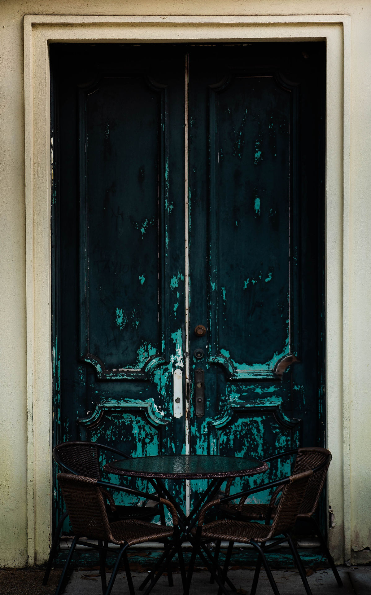
A Parade of Panzies Prancing in Pantsuits
I don't have a 'guilty pleasure' fashion trend, but I'll admit I've caught some flack for my affinity to pantsuits before. For your next task, you must make a pantsuit!
What qualifies as a pantsuit?
A pantsuit (which may be called a trouser suit if you live outside of North America) is simply an outfit wherein long legged pants are paired with a blazer or jacket. Traditionally, the pants & blazer both needed to be made of the same material, however, techniques, styles, and innovation have progressed to where material merely needs to look cohesive to be considered a pantsuit.
The base fundamentals for this task are... you guessed it - pants & a jacket. Everything else about the outfit is entirely up to you. The pants & jacket need to look like they are made entirely or mostly of the same material. Simply throwing a blue jacket on red pants won't achieve that. There needs to be some sort of visual consistency between the two pieces of clothing. Your jacket can be either opened or closed, and your Habbo can be male or female. There is no right or wrong theme for your outfit: you can go outrageous Avant Garde, or #GirlBoss power-dressing, or anything else your heart desires.
If you are going to inspire your pantsuit from an iconic outfit worn by a celebrity, please make sure your outfit has enough new elements to where it isn't plagiarism.
Your due date for this task is Sunday, November 27th at 8:00 pm EST.
Good luck!

Panel
Welcome to your 2nd panel. Looking at the crop of outfits submitted this week, there is a clear division between which competitors are here to take risks and who are here to play it safe. Longterms are not for safe outfits, and from this week on, I am going to make it my goal to be more punishing towards those of you who are trying to skate under the radar, instead of pushing the envelope with their creativity.
In this panel, I am not judging alone. Our first guest judge of Season 8 is a good friend of mine, and a phenomenal designer: Filip (Lidl-Wayne)! If you're newer to the community, Filip has hosted three tremendously successful Project Runway LTs of his own (two of which I competed in). Filip has not seen my critiques, which means our opinions are bound to clash. It'll make for some interesting reading material I'm sure.
Alright Filip, shall we?
It's time to see who blew our pants off this week, and who gets pants'd on the red carpet in front of the paparazzi.

fupaqueen
(Elise)
Snawl: This outfit packs a punch! I'm not well versed in retro clothing so I have no idea if that headpiece is pre-assembled or if you created it yourself with multiple items, but it ties into the outfit really well and prevents this from looking too uptight. That jacket & belt is like a PR no-go because of its overuse in 2012-2016, but the level of technicality on display has me enjoying it, and I can't recall a recent memory of it being used this beautifully. The retro clothing enhances your design without being a stand-in for originality; your talent is front & centre, like all PR outfits should be. This task was about putting an original spin on a typically conservative concept, and you did exactly that. This is brilliant, well done Elise!

Lidl-Wayne: Depressed Minnie Mouse. Sorry I just had to get that out of my system. This is an incredible pantsuit, it’s melancholic in it’s base and yet you bring up the energy a little with the bright orange accents. I’m always a big fan of fabric manipulation and it’s not easy to create a pant that looks unique yet not like clown clothes. You succesfully combine experimental design with commerciality on this one. It’s also kind of sexy to have a black low cut top instead of a shirt or something a bit more traditional, it shows you have an understanding of the full silhouette and how the body comes across in relation to the garment. Some designers, in opposite, like to put models in outfits that are wearing the models instead of the other way around. The headpiece has to go though, it’s a fun idea but the end result is tacky. Overall, a fabulous pantsuit and a chic presentation of a designer with several great ideas.


Peyton125
(Peyton)
Snawl: I enjoyed this outfit when you first submitted it, but as more of your competitors' outfits trickled in, I found myself thinking of this less & less before forgetting it entirely. The best part of this outfit are the centre colours & texture. I love the Indian crop top with the Thai necklace thing. There are fundamental issues however that keep this outfit far from the top of the herd. Pitch black always swallows up texture, so to have the pantsuit - the most important part of the outfit - all black... it's a shot in the foot. The shoes and the headpieces are a little too matchy-matchy to the point where they give off a Ronald McDonald vibe for me. I picked this outfit from your 4 drafts because 2/4 of them technically weren't pantsuits. However this wasn't your most impressive. If you survive, I want to see you take more risks with structuring. Your approach to tasks so far seems quite rigid.
Lidl-Wayne: Mhhhkay. The base pantsuit looks high-end and stylish, you could style it in so many ways and have it look great. I fear you styled it in one of the ways in which it doesn’t look good. Red and gold is in general a tricky combination to use as one must find the balance between the two rich colors. I’m having a hard time with the golden parts of this design, it cheapens it and it has no visual pay-off. The red composition on your model’s head is spectacular and for future tasks I think you should lean on that creative side of you, rather than tacking accessories on because ”why not”, this would’ve been amazing even with no accessories below the neck. Also, red and yellow shoes are a big no no, they’re for Ronald McDonald only. There’s great taste on display here (the black suit) but as your confidence grows as a designer, you’ll learn to ask yourself what purpose each element of your creation serves or not.

Pine
(Nate)
Snawl: I'm glad to see you ditched the formality and went with something more experimental. This is giving me a very edgy mid '00s punk rock Skye Sweetnam vibe. The pitch black headpiece took some time for me to get used to, but now I enjoy it. I also enjoy the struggles of gray sheen on the black pantsuit, it gives the impression you're wearing really squeaky, uncomfortable latex. The green & blue is nice but I would've loved to have seen more colour. Some dark purple and maybe even some muted orange thrown in the mix could have helped this outfit achieve a more eye-grabbing look. This outfit is good but it'll only be appreciated by those patient enough to stare at it for several minutes. All in all, a solid effort. Thanks Nate.
Lidl-Wayne: Incredible. You rarely get to see a creation that is avant garde in its subtlety. Absolutely adore the way the jumpsuit connects with the hat, it’s both unexpected and charming. This design walks a line between jumpsuit and a pantsuit, for me it's more of the former but that doesn't bother me. Be careful and really think about the technical instructions of a task in the future. Through your mixture of gray, black and different items, you’ve created your own, shiny textile. I’m crazy about that kind of stuff and I am very pleased to see so much innovation this early on in the game. The lime shoes paired with the navy blue accents make for a surprisingly good combination. You kept things interesting with this one, keeping things interesting is the key to win a longterm.

Okeefinokee
(Max)
Snawl: Everest green is an underappreciated colour in PR, and when it is used, it's often in something moody and depressing. It brings me joy to see it used so well in something that looks fun and wearable. The makeshift ombre in the centre with the rainbow graphic is adorable, and I love the diagonal interruptions from the lime green straps. I'm not a fan of the spaghetti headband, although I do agree the head needed some colour. The choice of pants is also something that I don't care for; the bagginess doesn't gel well with the top half already as loose as it is, it makes me think of a tent or a deflated bouncy castle. I love what you did with the feet, though. The subtlest peek of lime green harkens back up to the straps in a visually cohesive feast for the eyes. Flaws aside, this is another strong showing from you. Well done!
Lidl-Wayne: There’s just something about this that makes me want to laugh; with it but not at it. It sparks joy somehow. The graphical composition behind the jacket is fabulous and one of the better uses I’ve seen of the tattoo. I’m on the fence about the shoulder pads. On one hand, it is unusual and interesting. On the other hand, it looks a bit like steroids gone wrong. If I get go be picky, I struggle with the fact that the top features more skin-tight fabrics while the pants are so loose, the result is odd and slightly unflattering. I also find the shoes and the headband to be bad styling choices. When I look at the lime straps, I can't help but to think you were subconsciously inspired by Lee's winning butterfly design from last week. On another note, it’s lovely to see an older model being utilized. All in all, there’s a DNA here of a really interesting designer, but you still have a bit of work to do when it comes to editing.

LC22
(Elysse)
Snawl: I'm in love with this, it's friggin' fantastic! This outfit should serve as a PSA to all designers that not every accessory slot needs to be filled. The balance you have going on with this outfit is remarkable. It's this half grunge, half glamour aesthetic that I didn't think was even possible. Heels shouldn't work with a sports jacket but somehow I find myself transfixed. Doing a closed jacket pantsuit was such a risk because the illusion can so easily be lost, but the fact that you duplicated the white speckles from the jacket to the pants ties it all together as one cohesive piece. Then there's a subtle underlayer of black & gold sneaking a peek at the waist. The only aspect of this outfit I'm not loving is the hat - it's giving me early-to-mid '00s Jamie Lynn Spears. Also not a huge flaw, but this outfit could have afforded more colour. Besides that, this is a triumphant outfit. Excellent work!
Lidl-Wayne: This is a difficult one to judge. It’s overdesigned, a bit cheap looking and it barely comes across as a pantsuit. Still, there are several elements here that intrigue me. I have never seen a designer match the pattern of the jacket with another matching pattern and the result is jaw-dropping. I didn’t even know it was possible. How I wish to have seen this creation in a different color palette (the mustard yellow is distracting and unpleasant) and without the Krispy Kreme hat. To all of you reading this: that hat has never and will never be a good idea. I keep seeing this shoe a lot, which puzzles me. It’s a very specific shoe that has it’s own potential, but it’s hard to match. This was so not the task or the look for edgy nightclub shoes. Designers, there are so many nice shoes to use, sometimes you can even base a whole look around an unorthodox shoe choice. Stop playing it safe with the shoes! If you tone it WAY down with the styling and keep it up with the real innovation on display here, you could become the one to beat.
Slur
(Zoetic)

Snawl: Editorial power-dressing? I dig it. I find myself in love with the top textures so much so to the point that I don't even care if there is no prominent blazer. These textures are so wild that it really isn't a stretch of the imagination to say this is a pantsuit. Outfits with monotonous and analogous palettes are so so so dangerous in longterms because you're bestowing restrictions upon yourself that don't apply to the other competitors. However, your keen eye for graphics makes this piece really enticing to look at. The only change I'd make would be to pick a hat with a more subtle design pattern. This one sort of clashes with the otherwise formal aesthetic of the rest of the outfit. Also, not a flaw of the outfit per se, but this is the second week in a row wherein you submitted an outfit coloured entirely with a muted palette. You're great with muted colours, but I think it's time to start reaching beyond your comfort zone. Otherwise, great work this week.
Lidl-Wayne: My first thought is that this looks like the fashion version of Yoda's hut. There's a rich mixture of almost tree-like textures here which keeps things interesting. Somehow this design has elements I relate to dystopia, and simultaneously it has elements which gives off a positive vibe. I realize the value in keeping an outfit like this exclusively to varous shades of one color, but I can't help but to think this look would've been twice as cool with just a touch of blue or purple in it, something to give it a bit of a kick. I wouldn't look at this and think pantsuit, perhaps if the sleeves were of a different color. I believe you have great taste and I hope you stick to this cool aesthetic of yours as you keep on experimenting and growing.
Xav.Smi712
(Xav)
.png)
Snawl: I'm torn on this. I'll discuss the positives first: Your colour palette is dreamy and pleasant, and the way in which you dabbled the orange and green around is gorgeous. The white on the socks is very smart designing - it helps this look more like a real outfit and not a Habbo outfit. I'm also appreciative of you leaving the head blank. The collar design is a bit weird, but it grabs my attention. However... I believe menswear on this task was a very dangerous risk. Men all around the world wear pantsuits every single day, there is nothing novel or eye-catching about it unless you go above & beyond with some crazy theme or pattern, and you didn't do that. You also didn't do anything exciting with the jacket, I would have loved to see something more daring or innovative happen to that common jacket instead of just a wonky colour palette. At heart, this is a pleasant outfit to look at, but I am still waiting for you to get creative with your chosen fabrics.
Lidl-Wayne: The neckpiece is so cool, it portrays strength and get-out-of-my-fucking-way. We rarely see avant garde neckpieces and it’s especially lovely to see it so seamlessly incorporated into such a conventional thing as a pantsuit. I love the idea behind the look but the execution isn’t perfect I’m afraid. I struggle with the aqua blue color, it puts the suit into a certain aesthetical category you’d relate to someone like Austin Powers. Besides that, the creativity on display here impressed me and now you got me on my toes, eagerly waiting to see what you come up with next. As a designer, you’ve struck gold when you make your audience feel that way.

mickyricky
(Aqua)
Snawl: I always have respect for a designer who can follow the task while simultaneously making an outfit that is unapologetically them. This outfit is your style to a tee, and it's not at the sacrifice of quality. I love the intricate darker details on the chest, and I love that you surrounded them by the grapefruit colour on the scheme of the jacket. The pants have good vertical line textures that complement the outfit well. Your shoes however are begging to be a different colour! I also would've left out the hat because it oversaturates the orange and makes it look less special when it appears on the rest of the outfit. Besides those two nitpicks, you handled this task rather well. I love your style but I also want you to challenge it a bit - that doesn't necessarily mean exclude it, but try to push it to a new height you've not yet pushed it to. Thanks!
Lidl-Wayne: We’re seeing you evolve in real time, underneath the aesthetic and the tricks you’re so comfortable with, a designer with a new point of view and a new way of doing things is bubbling. The question is if you will let this new side of you fully emerge or if you will lean on what’s within your comfort zone. That tattoo has been done to death and yet you render it in an interesting way I haven’t really seen before. The mixture of yellow, copper red and this strange murky brown is a surprisingly chic color palette. It’s a decent pantsuit that could’ve been taken to the next level with some more innovation from your side. For future tasks, dare to throw everything expected out the window. Ditch the matchy-matchy approach, the matching eye-make up and the hat. Experiment more! Good job overall.
.png)
EagerGamin
(Marq)
Snawl: I watch a lot of film noir; I think I've seen this exact outfit worn by a movie extra as they offload a crate of rum from a truck in the shot background in a prohibition era flick. Needless to say, I'm not fond of this. This outfit has the same theme as your pre-advice draft - I don't know why you committed yourself so hard to frumpy, outdated, vintage pedestrian wear this week. The only thing even remotely interesting is the upper chest graphic, but it's interesting in its own nonsensical nature. This is a rare example of a motion pose actually hindering the outfit, because you took the photo on a frame wherein the shoes look glitched out and disproportionate. I have nothing positive to say about this outfit and so I'm just going to stop typing before I get mean. I admire you Marq, but this is a disaster.
Lidl-Wayne: This is very ”young person who works with trains during the first half of the 20th century”. What’s with the tie mixed with a bowtie? I appreciate unique ideas but it’s not a unique idea, you never see it in real life because it makes for a terrible result. The white composition you’ve created is interesting and it shows you have an innovative side to you, which is so important as a designer. The tricky part is to balance it with a good taste-level, that didn’t happen here. I find myself being more interested in the accessories rather than the actual suit. Normally I find slightly ugly things interesting, but this is just ugly and yet boring, I’m sorry to say. There is plenty of potential in the little details here though, such as the great choice of shoes.
nicrobbo95
(Nicole)

Snawl: I spent some time pondering whether or not this could qualify as a pantsuit. Ultimately I've decided to count it because the upper coat is clearly made in part by the same material as the pants. With the technicalities out of the way, I love this outfit a lot! Another fantastic outfit with no accessories on the head. The detective's coat I thought at first was obnoxious and out of place, but I think that's the magic of it - that's what makes the actual jacket stand stronger. The bohemian belt desperately reaching down to connect to the pants is such a lively feature that brings movement and drama, I feel like I'm looking at a beautiful, timeless Rococo painting from the mid 1700s. Then it's all tied together by those clunky white shoes, UGH. This is amazing and I am ever so proud of what you're achieving in this competition. Bravo, Nicole!
Lidl-Wayne: I gasped a little when I saw this. Completely in love with this design. This isn't where fashion is at today but rather where it's going. There's a rather extreme amount of layering going on and yet the model isn't swallowed by the garment, this looks like a super heavy construction with a mixture of loose and tight fabrics, yet the overall feeling is that it's structured. The way you've played with colors and prints related to the 1920-1930's as well as futuristic elements, I can't help but to draw a comparison to the designer Brandon Kee. Smart idea with the white shoes because what the look needed was a fresh kick.
lobsterbiscc
(Elobstabeth)

Snawl: I find it so compelling how you can take a familiar outfit layout with nothing special about it, and completely reinvent it with nothing more than colours. The colour coordination on this outfit is outstanding, you must've toiled over it for hours. The festivity of black, white, and greens under the jacket is to die for. I love the particles of lavender thrown around too. Despite the jacket & pants not matching in colour, I will defend this outfit and say it is a pantsuit because both pieces are equally slimming, and have vertical design patterns with no intrusions... although I definitely would have liked to see the pants coloured in a manner that's a little more relatable to the jacket. Either way, this is stunning. You've wow'd me with simple clothing. I can't wait to see what else you have in store, Lob. You have my full attention!
Lidl-Wayne: The brilliant thing about this design is that you've chosen a color palette that on paper doesn't work (red, purple, beige and green) and yet you came up with a fantastic outfit. Not only is the styling with the hair, shoes and the earrings perfectly appropriate and complimentary, but there's a sexy confidence to this whole look. The top successfully blends high-end casual menswear with more formal attire. There is this quiet, confident and sexy vibe to the overall look, if you can manage that I think you should never let it go. Keep trusting your instincts because this is amazing. A pantsuit should have the jacket and the pants match though. On a final note, an interesting choice of shoes which I applaud.
SealChowderr
(Lusealiya)

Snawl: This outfit disappoints me. The reason why this task had no other base rules is because I wanted the designers to reach for the stars and design whatever their hearts desired, so long as it fit the parameters of a pantsuit. Not only can I make a very compelling argument that this isn't a pantsuit, but I have a hard time believing this is genuinely you at your most creative. It's very outdated. If EagerGamin is offloading the truck of rum, I presume you're the pit boss who collects the money afterwards? I gave you outfit advice to change the shoe and you ignored it, just like last week. If I'm forced to compliment this outfit, I do think it's cool how the tips of the Thai necklace line up with the gold buckle on the belt. Besides that, I'm very underwhelmed.
Lidl-Wayne: I'm having a really hard time with this one. Your model looks like a teacher at Hogwarts. Not everything has to look modern or trendy, but this just comes across as a fantasy cosplay costume. It's unfortunate because you display some really great instincts with the pants and the shoes, I absolutely love that the two are in different colors that are still so close to each other, honestly one of my favorite bottom parts of the week. The overall silhouette with the flowy fabrics is nice, the implementation of gold and green just ruins it for me. Once again: a pantsuit should have the jacket match the pants.

gnge
(Lee)
Snawl: The most magical part of a pantsuit is the front because that's where it all clicks and comes together. To hide that is to admit weakness, in my opinion. From what I do see however, I can assuredly say you had a clear vision and you executed it deftly. The lavender purple, bright purple, and whatever-that-colour-is in the middle of the belt all complement the black & white stripes perfectly. I'm personally okay with '70s & '80s inspired fashion so long as it's done with taste and not a caricature, and part of what makes me enjoy this is the shoe choice. Those flare-heeled boots are very period appropriate, and it tells me you're operating on some level of cerebral decision making. The neon green apron however I dislike strongly. The apron's tie is too stringy - it looks like a mistake, like you were knitting, then rushed out of the house with a strand of yarn stuck to your back. Besides that, this is another week where your creativity is on full display.
Lidl-Wayne: The whole linear black & white stripes thing is an identity crisis every PR designer goes through sooner or later. This is mostly a fabulous composition, the neon details bring the look into the 80's however and I don't think that it did you any favours. The purple shoe with the striped pants is one of the best fashion elements I've seen this week though, it's a perfect combination. I also like that you used posing to your advantage, the other leg looks like it is in an inverted black & white striped pattern, opposed to the rest of the design. I don't think this comes across as a pantsuit that much but I wouldn't rule out that it is one either. A lot of chic elements here, my advice to you is to take on a more editorial and fresh approach to designing (like we saw last panel and in several ways with this look) and keep away from the 80's elements.
Panel Conclusion
This was a tough week that tested everybody's creativity, but it needed to happen. The overall quality of outfits is good, but I believe it could have been better. Nevertheless it didn't stop several of you from delivering killer performances. Congratulations to Nicole (nicrobbo95) for winning this week's task! A round of applause to Elise (fupaqueen) and Elysse (LC22) who occupy 2nd & 3rd, respectively.
The Bottom Three
Marq (EagerGamin) - You approached this task with a very rigid theme & colour palette in mind. Your unwillingness to let go of that theme limited your creativity, and thusly drove you into the ground.
Lusealiya (SealChowderr) - Out of all the "is this technically a pantsuit?" outfits I received this week, yours is the hardest to build a case for. On top of that, you received more outfit advice this week out of anyone, and put none of it to use.
Lee (gnge) - You are in the bottom 3 because you were late to submit this week! Sure, only by 26 minutes, but rules are rules. If I let 26 minutes slide this week, then next week someone'll ask for an hour... then 2 hours... then a day... then two days... then the longterm gets disorganized, players get discouraged, and it collapses. I'm sacrificing too much time & effort to let this game fail.
. . . . .The person I am eliminating is . . . . .
*Highlight text to reveal
Lusealiya (SealChowderr). Your outfit isn't the worst of the week, Marq's is. However, I am eliminating you for two reasons: #1) You didn't design a pantsuit. #2) I get the impression that your head isn't 100% present in this competition. You've ignored my outfit advice two weeks in a row - nobody concerned for their safety would ever do that. On top of that, creating a Discord account is free and takes 2 min. Your refusal to do so tells me this competition isn't in your heart, and that's okay. I hold nothing against you. You're a terrific designer who has graced my shortterms with some freakishly phenomenal outfits, and I hope this elimination does not end your patronage in my games, as well as other hosts who are lucky enough to have you.
A very tough elimination indeed. Thank you Filip for taking time out of your busy schedule to dunk on some outfits with me. For those of you who enjoyed Filip's critiques and would like to see more, click these hotlinks to see Lidlterm Season 1, Season 2, & Season 3.
Your 3rd task has been posted. Good luck, top 12!
1st Place: 300c
2nd Place: 100c
3rd Place: 50c
4th & Below : Jack Shit

The competition is stiffer. . .
The tasks are harder. . .
The host is more mentally unhinged than ever. . .
This is. . . Snawlterm Project Runway Season 8!
Artwork courtesy of icearbr
Snawlterm Season 8 is mobile friendly!