
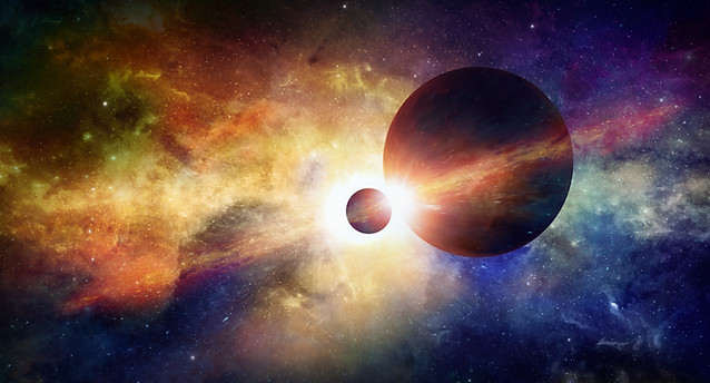
WEEK 2 - Designers in SPAAAAAAAACE
TASK
- OF THE -

For your second task, you are being served an impromptu in the form of your set. What this means is that I want you to design an outfit that looks like it belongs in this week's set - a space laboratory on Mars.
Your outfit can be whatever you interpret is relevant to this week's set. The sky's the limit.
Due to the campyness of some of last week's outfits, I feel the need to stress that this is a Project Runway. not a CC or RPDR. So for the love of God, please don't show up wearing alien/monster outfits. We're making fashion here, not costumes. The outfit also doesn't have to replicate the set, but it needs a sense of relevancy/belonging.
The due date for this task is Tuesday, the 15th. Feel free to contact me if you have any questions or concerns. And as always, good luck!


Panel
Hello final 12, and welcome to your second panel. As I'm sure you noticed, this week's task was more challenging than Week 1's. But to my amazement, the majority of you held your ground well, and delivered competent outfits. I am extremely impressed with this cast so far. I don't want to count my chickens before they hatch and say something grandiose like "This is my most talented cast ever!" But hey, you guys have been nothing but promising, so maybe I'll end up saying that.
Due to the enormous talent in this cast, the placement order can get skewed. You can deliver a good outfit, be praised in panel, and still receive a low placement if we feel like you were out-performed. This game is a very tight race, and as far as I'm concerned, the only person who has the right to be upset about panel is the person who gets eliminated. So unless you're eliminated, take a chill pill. Most of you aren't going to be top every single week, that's just how it is.
Joining us for Week 2's panel is the one and only emperor of the Habbo RPDR/drag scene, and a personal friend of mine - VYIA! With all that out of the way, let's critique some outfits!


Brian
SNAWL: This outfit isn't good, and even you admitted to knowing that. My biggest problem is the colour palette - it's harsh and has no charisma. A sloppily coloured outfit against a bright, vivid set just translates into an eye sore. When asking for outfit advice, you showed me a prototype where you used white instead of blue, and it looked a whole lot better. It wasn't amazing but at least it had balance, unlike this. Another huge flaw is your decision to pose backwards. Backwards outfits only work when you utilize that angle to its full innovative capabilities (ie when you make common clothes have a new meaning). But you're not doing that, except on the helmet, and that's just not good enough. That helmet + attachment combo isn't even original, I've seen it plenty of times. Arber gave you an exclusive talk about shapes & composition, and you still chose pants that are wrinkly and don't compliment the boxy top. Basically I hate every aspect of this design. I know you worked hard on it, but I can't evade the truth when judging.
VYIA: Taylor's critiques will be up shortly. . .
Zechariah

SNAWL: Woah Zechariah, I'm impressed! The general layout for this outfit is chic and simple, but your colour palette is absolutely exquisite. Hands down, THE BEST colour palette of the week. I just love the way you are using the glasses to almost create a mosaic with the cat face on the frontal region. The addition of dark forest green mellows everything out very well. But what I find most impressive about this outfit is how you managed to look cohesive with the set, but also modern and editorial. A few people took the editorial route this week, but you're the only one who really did it any justice. You've certainly been practicing since your departure last season, and I eagerly await your next outfit.
VYIA: Taylor's critiques will be up shortly. . .


Cinthia
SNAWL: This outfit has some really nice composition. I like how you were persistent with the gold lines, and allowed them to reappear in several areas. But in comparison to a lot of other outfits I received this week, this was one of the less memorable ones. The helmet idea sounds cool on paper, but when looking at it, I can't help but feel like you are covering up a large part of your canvas, rather than exploiting its space. The earrings are a cool touch, but nothing revolutionary. And while I admit that you plotted the gold in a good way, I just find the usage of gray to be boring. This outfit is pretty standard, and while it has no technical flaws, it fails to captivate me. You did enough to survive the week, but I want to see you rise to the top in the future; we all know you are capable of doing it. Thanks.
VYIA: Taylor's critiques will be up shortly. . .

Daryl

Peter

Harri
SNAWL: You did such a tremendous job at standing out this week; a week filled with captivating designs, you easily float to the top as one of the best ones. The idea to pair a bright red with a muted green is definitely peculiar, but you made it work so well. That detail on the upper chest is so enticing, ahhh I just can't get over it! I appreciate how the region below the belt, as well as the head was kept relatively simple, so as not to distract from the focal point of the outfit. The only flaw (and it's a minor one!) is the shoe colour. If the palette is outrageous, it doesn't make sense to use editorial nude shoes. But besides that pygmy detail, you really knocked this task out of the park! In my mind, you are a front-runner in this game. Keep it up, Daryl.
VYIA: Taylor's critiques will be up shortly. . .
SNAWL: The purpose of this task was to push boundaries and be original, and you serve me an outfit that I would expect to find in rupaulsotherwig's RPDR on round 1. I like you a lot Peter, but I'm not going to pretend this outfit is good. The pilot helmet + cyberpunk headpiece is a pairing I've seen done a trillion times before, and better. Your colour palette is really tacky and poorly incorporated, most notably the tree icon on your chest. The princess top, the panties, the ridiculous head accessories, all of it comes together as a staple RPDR outfit with no harmony or sense of style. If anything, I DO like the sideburns and how they blend into the jacket, that's kinda cool. But in reality, this cast is stacked with talent, and I just don't think you have the creative stamina to proceed in this competition. It's only Week 2 and you're already serving recycled RPDR looks. If you're out of ideas this early in the game, then that's a sign that your time is up. These tasks are only going to get harder. I'm sorry, Peter.
VYIA: Taylor's critiques will be up shortly. . .
SNAWL: I celebrate originality more than any other virtue, so when I get a contestant who is using the set to conceal the cat headpiece and give the illusion that it's a drapey hat, I gotta give props! And on top of that, you hid your feet to elongate your legs. This is pure innovation, Harri. Your peppermint colour palette is tantalizing, and you have great depth by toning the grey to the underlayer. The entire bottom half of this outfit is striking. My main complaint would be the beard and overcoat combo, because it's something I've seen Arber do several times. I'm not saying you purposely copied, but you really need to be mindful of that type of stuff. I'm giving you a pass because this outfit is fierce as fuck, but if it becomes a reoccurring theme, I will put my foot down. Thank you, Harri.
VYIA: Taylor's critiques will be up shortly. . .

Alex
SNAWL: I found your backstory/inspiration to be very intriguing. The idea of a high-fashion grunt worker on a spaceship in a thriller movie? Yes please! However, your outfit falls flat for me. This outfit has very little spectacle going for it, besides the neat detail on the chest. Quite frankly, this is teetering on pedestrian wear, minus the Frankenstein bolts. I actually do like the decision to keep the pants plain, but I would've picked a more contrasting colour. Your overall palette is too familiar to the set; if anything, you begin to blend in and get lost. This just doesn't stand out for me. This performance is quite boring compared to your triumphant reign of last week. I still see a lot of potential in you, and I'm crossing my fingers that you can unleash it in upcoming tasks.
VYIA: Taylor's critiques will be up shortly. . .

Alan

Sonny

Tiara

Whitney

Kaytie
Alex

Week 2 is history! So far, I'm really impressed with this crop of designers. For the most part, you guys have wow'd me several times, and continue to go above and beyond my weekly expectations. I await in agony to see what you guys can accomplish moving forward.
Sonny, congratulations on landing Best Photo for Week 2. Daryl & Zechariah, the two of you excelled high enough to land in the top 3. For our second elimination, we are saying goodbye to Peter. I am really saddened to see you go so early, but it is apparent that you are not on the same level of innovation as the rest of this cast. Thank you for being a good sport and flexing your skills in Season 6. You will be missed.
Task 3 will be uploaded soon. Congratulations to the final 11 for surviving your second panel!
SNAWL: I'm baffled at how generic and standard this is, especially given your out-of-the-box abstract outfit last week. You asked me for outfit advice and I couldn't give you any, because you didn't screw up anything on the outfit - the outfit is totally fine. The problem isn't the outfit, it's the concept, and the fact that you played it extremely safe on a task that begged for outlandish creativity. Besides the use of white, I don't see relation to the set. I admit your textures are detailed and well done, but a heavily textured outfit up against a heavily textured set just looks incohesive and messy. If I saw this outfit on a Red Carpet task in a shortterm, I might give it a second look. But this is way below par for this task. Your decision to play it safe did not pay off, and I hope this is the last time you make that decision. You are a phenomenal designer when you loosen the restraints, and experiment. I want to see that side of you again.
VYIA: Taylor's critiques will be up shortly. . .
SNAWL: I'd let you borrow a wig, but you just snatched all of mine with this outfit. Now I'm bald like you. This outfit is mesmerizing! You look like a worker aboard the spaceship, but in a couture way. You are playing with shapes and silhouettes; I am head-over-heels in love with what you did with those straps and how they blend in with the overcoat to create their own outline. I just adore your attention to detail, and how you left the front blank. This is a testament that not every outfit needs to be crammed with 58 accessories. The dash of red on the shoes, UGH I love it. Even the unorthodox choice of the Amish muffs are beautifully paired with the outfit. Last week I called you boring, but this week I'm eating my words. Superb job, Sonny!
VYIA: Taylor's critiques will be up shortly. . .
SNAWL: You managed to whip up a quick outfit that is colourful and fun. It's kind of vague in terms of telling a story/relation to the set, but it's vibrant and interesting nonetheless. It's nowhere near being a top outfit, but I think you've proven to yourself that you can design PR outfits. The pink & green is cute, and incorporated fairly well. Your use of a black perimeter is executed adequately. You do have some cohesive patterns with the scarf and belt, almost creating a perpendicular guideline. This outfit is sufficient, but not great. I think your biggest problem is over-thinking things. I want you to just go into the wardrobe and let lose for 5 minutes, mix and match some weird combinations. You'd be amazed at what you can discover.
VYIA: Taylor's critiques will be up shortly. . .
SNAWL: Buzz Lightyear's inner drag queen? This outfit is cool to look at, but I struggle to see it as a bona fide fashion piece. You did a good job at matching the set, but the outfit itself lacks harmony, and almost looks like it was designed by two people, each with separate ideas. The black & white portion is really enthralling, and I would've loved to see the aesthetic carried through to the top half. Instead, we get harsh purple & green, and some head accessories that weren't integrated well. This looks like an argument visualized onto clothing. Over-thought and over-compensated. I really want you to get in your zone and bang out some phenomenal outfits, which we all know you're capable of achieving. I know you struggled hard this week, but I still expected a little more from you.
VYIA: Taylor's critiques will be up shortly. . .
SNAWL: I must admit, your inspiration is a bit generic. "Oh a space task? Time for a shiny white metallic outfit with Cyberpunk accessories!" BUT I must say, you are pulling it off really, really well. Like last week, I am in love with the way you blended these ferocious colours. If they were in anyone else's hands, they wouldn't achieve such balance. My eye immediately goes to your head, and I just love that orange against the green. The suspenders + straps graphic you created is really neat and continuous. Very wise use of the pants, and I love how the orange makes a reappearance on the shoes. I oddly like the simple, almost casual silhouette of this. Most designers would've made it heavy with an ostentatious coat. This is a beautiful outfit, I just wish it had more of a significant splash in panel instead of just ooOOOoo look at the pretty colours! Nice job though.
VYIA: Taylor's critiques will be up shortly. . .

"I'm doing double eliminations to speed this fucking game up, and then I'm never hosting one ever again." - Snawl, Season 2
"This is definitely going to be the final SnawlTerm."
- Snawl, Season 3
"I want to quit while I'm ahead, ergo, this is my last season." - Snawl, Season 4
"I swear to fucking God I'm not hosting any more of these." - Snawl, Season 5
It looks like I don't learn from my mistakes.