
-Hosted By The Legendary Snawl-
Project Runway
Week 6 - Panel
Because of a horrific performance on Week 5 and constantly being late, Liberty has been eliminated outside of panel. She is gone and we're moving on. However someone is still getting eliminated this week, so we will be at the final 9 until I announce who wins the Entry Series and gets a guaranteed spot, making it the final 10.
For this week I asked you all to convey a story through a movie poster with moving elements in the photo. A very straight-forward task so I was really impressed by how a lot of you handled this task. A lot of you went above & beyond and crafted stories that were creative and interesting. I am convinced that some of you put more effort into your stories than your actual outfits.
Week 7's task is now posted, and during this week [some time before panel], I will reveal the contestant who will be entering the game. The reason behind this week's major delay was due to my work schedule being too adjustable without my consent. I will try my best to never have this happen again. I am just as angry and frustrated as you guys are.
Alas, it's time to see who became a Box Office Success on opening night, and who will be a Direct-To-DVD flop.
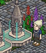
First up this week is Jade
Outfit: I think this is one of the best things you've designed all competition for the simple fact that designing an outfit that looks grimy but still high fashion is a difficult task for ANY designer, but you managed to pull it off. It may look simple, but this outfit is actually very complex. The thing I love the most is how the accessories are all working cohesively with the theme, but they're all coloured differently. A lot of people just colour the accessories all the same, and it ends up looking tacky, but you avoided that. Every element on this piece is amazing and nothing is redundant or unneeded.
Poster: As a theatrical piece, I think it is stunning. This is MILES ahead of your moving photo from Season 1 which was basically a cluster of moving bullshit overtop a mediocre outfit, but this looks absolutely chic and fabulous... The rain is so simple but it adds so much drama, and it also plays into your story perfectly. Thank you for restoring my faith in this competition!
Second up is Kayllah
Outfit: I think this is a really good outfit because it is almost borderline cliche and generic, but it's not because you elevated it. It's a combination of a mundane outfit plus a tacky costume, but you managed to take two negatives and make a positive. I really like the use of the sunglasses because it adds an ocean of emotion for the viewer to ponder over. My favourite part is how you toned the shades of grey from the top to the bottom. The hat could've had more of a thought process invested into its colours, and the earrings sort of stick out wrongly.
Poster: Even though I'm not a total fan, oddly enough it works as a movie poster. I could see it being used to market tickets at the box office because it looks mysterious and enchanting. My main critique is that you could've used the moving furni aspect better. You have a floating candle that looks completely random, and the flickering light posts that are difficult to notice. Also since your outfit is long and large in stature, it's a shame you shortened yourself by sitting down.
Up next is Kara
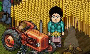
Outfit: The textures and fabrics are nice, but these colours are messy as fuck. Had this photo been in black and white, you'd look like some olden-day Eurocentric heiress, but instead we got Malibu Barbie visiting the farm at which they put her dog down. The colours totally clash and I mean that in the worst ways possible. The pink and gold look like they're about ready to kill each other and frankly I am ready to kill you and bury your corpse in that crop.
Poster: I think it had a lick of potential to be a decent poster, but I am not a fan of the pile of fresh, steaming shit heaping next to you. Why you thought that was a good idea? I don't know. Despite the outfit being totally tragic, I think your angle is good and you're showing the outfit off well. Unfortunately you're being outshined by a tractor and a heap of horse shit.
Nextly is Savon
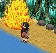
Outfit: This outfit is creative, intricate, ornate, and definitely the best thing you've designed all game. The fading from orange to brown is genius, the slippers, blossom skirt, headgear, it all works flawlessly. This outfit looks straight out of a movie; in a salvaged sense, but it still looks like a fashion piece. The backpack is questionable but I guess it ties into your massive storyline.
Poster: As a poster, there's pros and cons. I like the use of the fire because it has that intensity that is relevant to the plot, but the rest of the photo is very boring and looks like filler. Everything seems oddly positioned and the only way the viewer would understand all of these elements in the frame is if they were to read the grandiose storyline that you e-mailed me.
Up next is Bri
Outfit: I like the outfit but I don't really see much of a relation to your story. It's beautiful, but from a different perspective. This looks like a couture dress modelled after some earthy element, rather than an outdated gown for a formal occasion. However I loved the way you mixed and matched the colours. The palette goes from cold to hot as you look top to bottom. You designed AROUND the accessories rather than just slapping them on, so that's very nice too.
Poster: Had it been a mythological, supernatural movie, this would've been a great poster. But with the story you give me, I don't see much of a relation. But it's still a good photo.
Next is Vicky
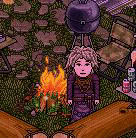
Outfit: Out of all the outfits I judged so far, this is definitely the most costume-like piece. I don't know if that's a good thing or a bad thing. I love the colour palette but I think something as subtle as tinting the belt or the dress a darker purple, or a light brown would've added a lot more dimension to the outfit. The gown is beautiful and I love the rapid change of textures as my eye goes from top to bottom. Also the long sleeves make you look majestic, yet eerie.
Poster: I love the idea/story you presented me with, but the photo itself doesn't do much justice. The idea of posing by the fire was good, but the furniture around makes it look cheap and filthy. However I really think that the dimmed lights were a smart edition because it gives off that dark, gloomy vibe. Overall I like the photo but it could've been better.
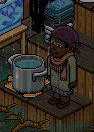
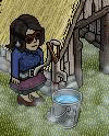
Come down, Joseph

Outfit: As simple as it is, I love it. It looks magnificent in the most effortless way. But I am worried because I don't know if you were actually going for simplistic beauty, or if you just got lazy and this photo got lucky and miraculously struck a cord with me. My favourite part is the support it gets from the black jacket because not only does it make the outfit look more solid, but it also gives it that modern feel that I like in fashion. If I had to change it, I would maybe add some texture or very minimal colour variety on the front with the shirt & belt.
Poster: I actually like it a lot. I think it captivates the sorrow, resentment and despondency that your character is enduring. My only problem is the fact that I can't see your shoes, but at the same time I like the water because it makes me imagine the tips of your dress being damp as you traipse through the shallow waters. Very theatrical!
Joel is next

Outfit: I HATE IT! What the fuck is this? This doesn't even look like Joel. You look like a cross between a cheap Atlantic City stripper, and those undead nurses from Silent Hill. I kinda like the idea of the nurse hat but the rest of the accessories are completely pointless and add no value to the outfit. I seriously can't- WTF? I can't believe you designed this because you're soo talented but this is soo bad. It's like you totally gave up. I am trying to imagine this in real life; that maybe you were going for another unorthodox fashion statement, but it looks even worse in my head. There's sometimes just some things that don't work at all in the world of fashion and THIS is a shimmering example.
Poster: You didn't really understand the task well at all. This task was for you to create a backstory, but you almost created your own task. I asked for your story and you said "luxurious beachwear of the 1950s." That's not a story, that's a task. I am trying hard to apprehend myself and not sound so harsh, but this is possibly the worst picture of the entire game so far. The outfit is horrific, you didn't understand the task, the picture is bland, and at the end it just doesn't make sense.
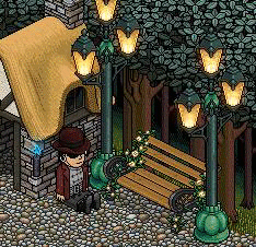
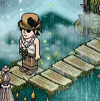
We have Skye up next
Outfit: I really like it for its couture, and solemn feel. The colour palette is really nice and majestic. It's a great outfit but my biggest issue is: it doesn't pose as much vitality within your story. The outfit looks dark and mystical, yet your story is about a runaway girl living in a forest. The heels are a bit unrealistic and the facial accessories, although I love them, feel like they don't fully belong. However I still applaud this photo because this looks like a legitimate fashion shoot. I can picture you in your majestic gown blowing in the wind outside the straw house.
Poster: Your story is more drama than fantasy or supernatural, so I am on the fence whether I think it is an appropriate image for what you are trying to convey. As for the photo itself, I think it is really captivating and could easily be a fashion shot. Just next time try to be a little more cohesive with your inspiration.
Lastly is Valentina
Outfit: VERY nicely balanced! This outfit is a near flawless with the exception of the eyepatch. Everything else is bloody perfect. The two-toned gown split at the waist was an incredible idea and the fact that you tinted your heels just a tad darker makes the outfit look so much more grand. The white textures up top ties into the story while having elegance and grace. Even the butterfly on your hat serves a purpose. This is by far the best thing you've designed. You've been doing so amazing lately I feel like you couldn't lose if you tried.
Poster: This is, hands down, the best poster of this week. Why? Not only is it extravagant, beautiful to look at, and fully utilizing the motion feature without being TOO crazy, but it also ties into your story amazingly, and the outfit. You embraced this task; you harnessed it more sturdy than anyone else. This is the best moving picture I've ever seen, and that includes the ones in Season 1. The degree of emotion illuminating from my screen is purely jaw-dropping. I even said it as I was photographing you that the final product was amazing, and it looks even more amazing when I upload it here and compare it to everyone else's efforts for this week. No shade intended.