


TASK #7
(retro)Future Nostalgia
Predicting The Future
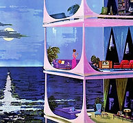
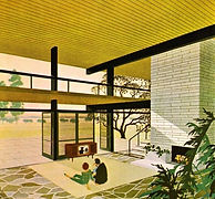
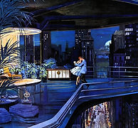
In 1961, Motorola commissioned an American artist from rural Illinois to create an art campaign whose goal was to spotlight a new line of Motorola's domestic technologies. The resulting art is "Homes of The Future" by Charles Schribbe... and honestly, they're fucking astonishing. Click the button to the right, and have a look.
imgur link, 21 images

For this task, I want you to design a runway outfit inspired by womenswear of the 1960s. The colours you use on your outfit need to be inspired by one of Charles Schribbe's future home art pieces. Yes, you can add your own colours too, but I want to see a visual correlation between your outfit and the photo you select. You don't need to blend into the art, just make sure the original artist's palette leaves a fingerprint on your outfit.
This task is tricky. I'm basically asking you to make a fierce runway outfit from old, outdated, vintage clothing, whether it be domestic homebody or corporate power-dressing, or something in between, the choice is yours. Let yourself be inspired to use textures and fabrics you may otherwise avoid. Your outfit merely needs to be inspired by the 1960s, it doesn't need to look literally ripped from the time. You're still selling clothing, you still need to turn heads.
Hello and welcome to your seventh panel, final eight.
This week was very difficult. You all made that known in both your words and your submissions.
This is the first week of Season 10 where I feel the majority of you fumbled in some way.
Our Top 3 did great, but everyone else could have done a lot better. This is nothing to be ashamed of.
I make difficult tasks on purpose, to be challenging. If you're one of the many who struggled, don't let that extinguish your drive to succeed. Use these adversities to fuel your next outfit. Unless you're the person being eliminated, please remain grateful. Clouding your judgment in anger & paranoia has never helped anyone, ever.
Filip (Lidl-Wayne) is back in the judging seat with me one more time. Let's get going.
PANEL
Sarah (sparkle)

SNAWL: Okay so we're getting gogo boots right out the gate, I dig it. The most startling part of this presentation is in its reserved and almost underwhelming nature. I must admit, I did anticipate a far more vivid and lustrous colour palette to be born from your chosen image, but I can't say I dislike the decision to platform the shiny silver either. The bouncy skirt - which struck me as too juvenile in your prototype - is now far more palatable with the calmer colours. Your upper chest has an interesting and original texture, but sadly it sort of just sits atop what is otherwise a pretty standard outfit. You certainly captured the youth culture of the mid-to-late '60s flawlessly, so I commend you for that. Did you blow us back with something showstopping? No. Did you design a cute outfit that nails the task? More or less, yeah.
LIDL-WAYNE: I love the surrealist tit situation. As your chosen painting plays with levels, it’s fun you did that as well with layers. I can’t escape the thought that this looks like a cheerleader costume, it’s the white stripe on the skirt that does it. Frumpy? Yes. Fierce? Well, kind of.


arber (icearbr)
SNAWL: You look like an old hairless cat lying on her belly, showing off her nips. Here at Snawlterm, we love slutty mammal tit teasing. I'll ask our producers if we have any lactation pads in the first aid trailer. Anyway, you understood this task thoroughly well, and it is because of that iron clad understanding that you felt comfortable taking such a massive risk. Designing an outfit that is more or less lingerie is as risky as it gets, and while it isn't totally flawless, I do think you hit the marks you set out to. The ombre colour gradient, the posh diva housewife aesthetic with the glasses and hairdo, the Pride cape expertly trimmed to only show the fringes to make your bottom half more symmetrical, it's all quite methodical and genius. Is it bordering on stereotype? Yeah, but for me that kinda makes it better. I wish the rest of the contestants had as much fun with the '60s theme as you did.
LIDL-WAYNE: I really disliked this when I first saw it. Then it kept popping up in my head: on the bus, at the supermarket, at my tax evasion investigation. That is to me the sign of fashion that has fulfilled its purpose, when it makes you react, feel and question the parameters. A quick peek at this may have one just disregard it as nothing but a bathing suit, but there are many layers to this design. Gorgeous color palette as well.


Alan (alanio)

SNAWL: You gave me six outfits to choose from, and I honestly wanted to choose all six. You & your iconic style was a match made in heaven for this task. I love this outfit, from the dress to the hodgepodge black graphic. I'm iffy on the stethoscope, but I do love the tiny dash of green. The brown overcoat reinforcement is beautiful and not only helps you achieve possibly the most loyal companion piece to your chosen artwork, but also helps you make that blouse your own. The gogo boots could have afforded to be a different colour; possibly something tamer like a dark brown or light pastel yellow, but that's honestly a non-issue and I'm just filling space. This outfit is fantastic, and I am so happy for you because I see just how hard you've been busting your ass off every week. Keep this up!
LIDL-WAYNE: A design that is somehow suspenseful - I feel a nervous, yet tickling sensation seeing this. Perhaps the yellow dress and its accompanying accessories represent a happy, optimistic home, while the black details represent a certain rot that is on its way to corrupt a life or two. Painfully beautiful.
becca (oyt)
SNAWL: There is a thorough and intimate understanding for your artwork's congestion of blue sky and buildings, and it is appreciated expertly on your underlayers. The idea to pay homage to the green silk garment on the female subject was a tenacious decision, but it could have been incorporated into your final product more uniquely and methodically than just the jacket. The jacket itself is lovely, but it hurts the marketability of the rest of the outfit. It's like you were just rescued from a tragedy, and the paramedics draped whatever fabric they could find on you while they examine you for injuries. Had it been interwoven into the dress itself, that would've been a knockout for me. Moving on, I like the idea of white accessories but I wish you picked a thicker headband, as these thin ones have a tendency to look cheap on Habbo, like Spirit Halloween or Party City type apparel. Overall, I think you've become talented enough to where you can make most ideas work, so now it's just a matter of thinking of those ideas. That extra pinch of originality that is needed to push you towards the front. Good luck.
LIDL-WAYNE: On paper, this is a damn competent design. In the world of fashion, the word competent is most often not what you’re looking for to achieve. This design has a cute color story that makes sense, a dress you made into your own and styling that looks like it was carefully considered. The outfit just makes no music whatsoever. The green jacket is random, like she popped down the corner store to buy some more crackers for her party.


elysse (lc22)


SNAWL: This outfit is soooo you. I am amazed at how you are able to take these diverse tasks, match them to your aesthetic while not losing sight of their authenticity, and still stay on the mark for the week's theme, all while giving me something I've never seen before. This outfit is an explosion of 1960s pop culture, and bodacious patterns that reference everything from batik to op-art. Admittedly, your palette is less linked to your artwork than most of your constituents, however, I did say you were allowed to deviate, so long as the soul of the art didn't leave your outfit. Not only did you capture the soul of the palette, but I feel I can actually see the geometry of the architecture in your outfit, too! This is possibly your strongest showing yet, well done once again.
LIDL-WAYNE: Two words that don’t really go together but that describe this look: cute and fierce. A dress with a mixture of graphical elements like this one was not what I expected for this task: unexpectedness is key to succeeding in this line-up of hungry, talented fashionistas. Although the dress is sublime, the styling is what really makes this shine. I absolutely love the hot pink scarf and how it plays with the other shades of pink and purple.
rae (saffrons)
SNAWL: The magic of this outfit didn't jump out at me initially, but after listening to my guest judges and contemplating your item choices further, I have come around to enjoying it. There is clear intent in the decision to go almost minimal with the fabric textures. Monochrome on such a simple outfit however is a huge risk, and there are aspects where I feel the risk may not have paid off. I love that the cape fits the blouse's silhouette almost identically. I also love the makeup and earrings; you accessorized everything tastefully and it all looks very in vogue with the era of the task. However, I can't help but feel the bottom half of this outfit wasn't fully realized. I wish you used a different top all together, just to give the cape a more domineering presence, and to also free yourself up with the bottom half. Even a small, straight, solid colour dress with minimal texture would have still fit your goal, while also appearing more intentional. My guest judges may love this outfit, but to me, it feels only half-realized.
LIDL-WAYNE: The dress itself is stunning and could be an art piece itself, placed on a mannequin somewhere in a museum. I believe you deserve points for that reason since this is an art task. It looks like fabric that is falling. The more I think about it, the more impressive this design is: it takes the baby doll dress, which dominated the 1960’s, and renders it in a slightly more modern way. I find the shoes to be a problem, I would’ve liked to have seen something more sharp and sleek (and preferably metallic) to take it to where it could be.

mickey (player)


SNAWL: I find this to be gorgeous, but only when I eliminate your Habbo. I chose the pose that best conveyed your wish for the pants to be interpreted as a dress - that's no problem. But then the celestial cape (or whatever it's called) juts out like a butcher's apron. I strongly dislike the raised arm because it betrays the illusion you first achieve with your head spun around. The head facing forward tells me the cape/apron is your front... okay, no problem. But then that friggin' arm and the macaroni shape shoulder just ruins the illusion and makes me go "Okay wait, so is the animal pouch supposed to be the front!?" I'm A-okay with glitches and illusions, but not when they scramble my perception of what it is I'm supposed to be looking at. As for the outfit itself: like I said, it's gorgeous. You're one of the best colour palette blenders I've ever met, and I love that you ignored the obvious muted blues and instead went full purple. It's ballsy. The dreamlike innocence from the cloud shaped ruff is cute as hell, and really leans into the stargazy quality of the apron. All in all, this is stunning, but it's hard to appreciate due to the barriers initiated by the weird body horror pose.
LIDL-WAYNE: I feel I have seen this magic wizard dress before, multiple times, in various ways. It’s not frumpy enough and it’s not 1960’s fierce. The dimensions make little sense, what is your model carrying in the front? This sort of high-neck bolero you have created is fantastic but I believe you stayed in your comfort zone for a task that really is a challenge in relation to your usual aesthetic, which is a shame. Comfort zone is the eventual kiss of death in a longterm.
nicole (nicrobbo95)
SNAWL: If it weren't for your colour palette, I would think you read a different task entirely. You said in your explanation that you wanted to create, and I quote, "a more modern and streetwear approach" which to me just looks and sounds like you wanted to do your own task... girl, that's what the finale is for! This week is about 1960s frumpy + fab, but this outfit is late '90s RnB. Your exaggerated button is an obvious ode to the haute couture, single button blazer trend of the '60s for sure, but that doesn't rescue the whole piece. The motion pose achieves nothing except making your shoes look like gummy worms. I like the industrial pants, and had you coloured them anything else, I think you could make an argument for a vintage refurbished approach, like an old world meets new world theme. Even then, that would be a stretch. This is a cool outfit, but I'm afraid it's too far gone from what we were asking for from you this week.
LIDL-WAYNE: With no context, this is great. Washed out white fabrics, urban streetwear that is so clearly architecturally inspired. Green eyeshadow that actually looks fantastic for once. I love that one striped sleeve in white & baby blue. Brad said that the design doesn’t have to look entirely 1960’s, but he did ask for something frumpy (and fierce) and this is anything but frumpy. This looks like something a kpop artist would wear on stage or in a music video today.


Let's put this difficult week to bed once and for all! Congratulations to everyone who survived, and for your perseverance. For my Top 3 of this week, I am going with Arber (icearbr), Alan (Alanio), & Elysse (LC22). The three of you did amazing, but for the win, I am going to give it to Alan (Alanio). Well done! This was your week to ace, and ace it you certainly did.
Week 7
Top 3


The Bottom
Selecting a Bottom Two was tough, but I ultimately settled on . . . . .
Rae
You presented us with the start of what could have been a show-stopping outfit, if only it had been fully realized.

Nicole

Whether it be due to a misunderstanding, or a failure to cope with the difficulty, you submitted an outfit that feels greatly detached from the task.
The Designer I Am Eliminating Is...
[Highlight the text to reveal]
Nicole (nicrobbo95). For the third Snawlterm season in a row, I am terribly sorry to do this to you, but the disconnect between the task and your final outfit is just too wide to ignore. On the bright side, you get to go out with an outfit you are proud of, and that speaks to your creative spirit, so that's a small victory in itself. I hope to see more of you, whether it be in short-terms (if they ever make a comeback?) or in future LT installments of which any of my hosting constituents would love to have you. Till then, take care, and thank you so, so, so much for the loyalty and hard work you've shown me in my most recent LTs.
Well done, final seven. We are also bidding farewell to Filip (Lidl-Wayne), whose tenure at my judging table is up. If you enjoyed his critiques and would like to see more, definitely check out his wildly successful PR LT series of his own. His most recent season can be found here.
Your eighth task is up, now let's go before this difficult week sucks us in any longer!