


TASK #10
All The Beauty,
And The Bloodshed
The Favelas

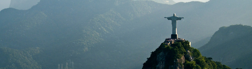
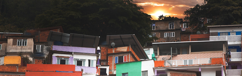
Brazil's Favela neighbourhoods are likely the most recognizable feature of the country; more so than the Brazilian flag itself. Everything from paintings, to literature, to video games have either borrowed from, or took place directly in these shanty yet colourful towns. Despite the apparent beauty, these Favelas are actually shining beacons of class inequality, corrupt law enforcement, and seedy black markets. Almost every major Brazilian city has a Favela style neighbourhood, designated for lower class families. Due to federal neglect, and other political shortcomings I won't bore you with, these beautiful networks of buildings inadvertently provide ideal shelter and anonymity to criminals who enrich themselves by committing the worst crimes you can think of. To Brazil's credit, their homicide rate has decreased by an impressive 1/3rd since 2017. However, these Favelas still remain as some of the most deadly urban sprawls on earth. It is a shame how foreign media & art who borrow from the Favelas aesthetically, almost never acknowledge the cold reality they hide. This week, we will not make that shortsighted mistake.
For your next task, you are going to design two outfits. Each outfit is weighted an even 50/50 at panel, however, their success is interlocked. Your first outfit is going to be Avant Garde, and it will be inspired by the urban sprawl of the Favelas. While this outfit will undoubtedly have a lot of interesting colours, I want you to use this outfit to show the brutal truth of the Favelas. I want to see some form of poverty or gun violence portrayed in your Avant Garde outfit. It should go without saying that I want you to use ingenuity & symbolism to design something tasteful. I don't want offensive, cartoony, or anything that could be seen as a mockery towards disenfranchised people.
Your second outfit of this task will be a long, simple dress or gown. I want you to show the beauty, vibrancy, and spirit of the Brazilian people who live in the Favelas. Despite the living conditions, the citizens do their best to make these neighbourhoods culturally rich. Music, dance, wall art, even extreme sports like skateboarding & parkour take place daily in these areas. Unlike your first outfit, this one will NOT be Avant Garde, and will instead carry an air of positivity and rich cultural spirit. Your dress must be long - at least passed your avatar's knees. Also, your dress must only feature colours that appear on your Avant Garde outfit. Any shade or hue used on your dress must be visible on your first outfit. The proportions can be wildly different, they don't need to share the same percentage - and no, you don't need to use every colour you use in your first, for your second.
This may sound jumbled so let me summarize:
Two outfits.
First outfit = Avant Garde, inspired by the Favelas, and their seedy underworld. Second outfit = Simple, elegant dress, using colours only found on your first outfit. Any further questions or concerns? Ask me. I don't mind.

My Final Five.
Welcome to your penultimate panel.
This is our last "normal" panel of the season, because after this, we're goin' to the Finale!
The three of you who survive this panel are Season 10's official finalists.
Congratulations on yet another fantastic week. The ten outfits submitted this week are genuinely amazing, and act as another further solidifier as to why you are all still here. The level of quality has me in awe, and you guys didn't make deciding who to eliminate easy this week.
Season 7's champion Zechariah (HerbyMainsted) joins us one last time. Let's get to work.

herby - Avant garde

snawl - dress/gown
PANEL

sarah (sparkle)


SNAWL
Outfit 1: I want to like this outfit more than I do, sadly. There isn't anything here that I could argue is Avant Garde; everything is oddly reserved. The pajama top is interesting and I think if you leaned harder into the sort of medieval, Anglo-Saxon pied piper aesthetic, you could have created a very gorgeous stitched gown whose sporadic patches and shapes would resemble the rectangular houses of the Favelas. Instead, you throw over it a cape that immediately disappears behind your back, and add a chest decal that looks inconsistent to all your other textures. Your colour palette is also flat and one-note, even though you're using a palette I normally enjoy. If this was an attempt to convey Avant Garde using only flat fabrics, then I wish your colour palette was more bombastic.
Outfit 2: The polka-dot dress and the gargantuan hem at the bottom is fantastic. I love how seamless the two pieces transition. The silhouette itself is so eye-grabbing, it needs minimal detail, so I like that you didn't cover it with accessories. This murky, stale, washed out colour palette works so well with this outfit and its relation to the Favelas. It looks like an artist using whatever means they can cobble together, to express themselves through the movement of their gown. What would I change? Hmmm, the outer jacket is a bit awkward and it does seem like it needs something else to help attach it to the rest of the canvas a bit more loyally, but it's not glaring. The overall presentation is really great.
HERBY
So you've got two outfits that are definitely great for the task, They're not my absolute favorites but they both work well together, each piece complements the other perfectly, and the colors I do appreciate you going on a more toned down route with the color palette than your other competitors . If I have any qualms your second dress Could've pushed it more, in the center region. The polka dot dress isn't really adding anything special. I still think it's a solid effort this week, you just didn't push it as farther than the others.


SUMMARY
Like last week, I feel like your artistic vision was a bit half-realized. Then I learned about your difficult situation, and it all made sense. As your friend, I want to give you clemency, but that would make me a dishonest judge, so I have to look down the barrel of the shotgun and simply say your performance this week was mildly underwhelming. Whether or not it's enough to get you to the finale will depend on your fellow competitors. Good luck, Sarah.

elysse (lc22)


SNAWL
Outfit 1: Knowing how much of a fan you are of thin, gaudy, plastic looking retro hotel accessories, I am thankful you didn't go too insane... however, it still looks like you're having a Mortal Kombat fatality performed on you. Your approach to the sinister underbelly of the Favelas is a bit on-the-nose, and not in a very clever way. The outfit underneath the spiky item is really nice, even if you are using some older tricks. I am enjoying the reversed apron in relation to the orange mesh top. The symmetry between the apron's rectangles and the top's circular designs is intriguing. Situating it all on top of a black gown with a droopy hem gives it this almost phoenix rising from the decay symbolism. It's a nice outfit, I just wish the Avant Garde looked more intentional.
Outfit 2: The amount of reserve and patience it must've taken for you to submit such a simple gown with minimal patterns can't be understated. This outfit feels very out of your comfort zone, and I love it. The colours and fabrics scream coastal Brazil to me. There is a 1970s early disco spirit to this outfit that I also often find myself associating with Brazilian pop culture, as their media tends to hold onto fads longer than the rest of the Western world. I love the glaring nature of the pearls and eyeglasses. The gold buckles are obvious, but cute. I wish you had paired a hairstyle to the piece, but that's not an issue. What is an issue however, is that I can see maybe three pixels of your shoe, and the rest is clipped. That's not a visual error I expect from someone as deft with editing as you are.
HERBY
These two outfits are seriously stunning. something that I absolutely love is how they subtly complement each other while being vastly different. It's like they're having a quiet conversation without screaming for attention. While your first outfit is greatly detailed I'm not really enamored with the middle section with the apron and mask, it doesn't blend well if I'm being honest. I'm more personally interested and intrigued by the Bald Granny. It's so sleek, sophisticated, and chic, it's what I absolutely love to see. keep up the good work.
SUMMARY
It seems that long gowns aren't your strongest suit, as you have struggled with them in past long-terms as well as this week. Oddly enough, this week it is the items above the gowns that I found more problematic than the gowns themselves. Your outfits this week aren't the most refined from you, but there exists a free-loving, creative, and oddly optimistic charm in them. I can't say you didn't deliver.

arber (icearbr)


SNAWL
Outfit 1: There is this uniformly chaotic, yet perfectly matching composition with your top items that make me think of a rotting, dilapidated building. You expressed worry over using a literal gun in a task about violence and poverty, but honestly, I love it, because the item looks nothing like a gun. You're using it to add to your mosaic of outward blossoming shapes. I am so in love with the small brisk brushes of face paint that look like they're emerging from the aforementioned items; this outfit looks like an infection of sorts. To be inspired by the Favela's cramped living spaces, and then design a cramped outfit, may sound like an easy button... but my God, if this outfit isn't the most innovative I've seen from you. Superb work.
Outfit 2: While there is an air of Avant Garde to this outfit from the blue attachments that I wasn't really wanting from you on the second outfit, I have to concede and admit it really ties together the whole palette. Because the blue is such an influencing shape, you really didn't need any other accessories to tie the bottom of the gown to the top, and you realized that. The fabric textures on the sleeve is awkward and probably could have been smoothened out with more time, but the mint green it provides is a flawless tertiary addition to the palette. This outfit is whimsical, fun, and very reminiscent of the resilience and optimism of the Brazilian people.
HERBY
*puts down phone and goes and stares into the night sky and questions if I've ever made a good outfit*
Holy fucking shit. You absolutely knocked it out of the park with these. You encompassed the challenge the most out of your competitors. In your first outfit I can feel the vibe of the dark side and beauty of The Favelas. Your fashion taste is impeccable. This 2nd outfit. The Gown I could see these be made into a real outfit walking the Met Gala. It's just structurally very strong, and I'm falling in love with it. If you don't win this week I will be fighting Brad. (<<<bitch please)
SUMMARY
I really considered eliminating you last week. I feel you missed the task harder than anything I've ever seen you miss... and eliminating you would have been very hilarious. However, this week, you came at me with everything you have. Every tool in your mental arsenal is on proud display in these two outfits: Your understanding of symbolism, your unparalleled ability to match shapes that are different but similar, and your passion for colour theory. You submitted what I am quite comfortable calling two masterpieces. Way to make your spot in the finale all but guaranteed. Excellent work!
mickey (player)
SNAWL
Outfit 1: This just may be my favourite outfit of the ten submitted this week, as well as my favourite from your portfolio this season. The blacked out skin, face, & hair is so audacious, yet totally necessary. The fabrics tied tightly around the model's face is such a brilliant cohesive carry-over from the striped torso. The beige fabrics add much needed negative space which makes my eye sort of fight to see the colours behind it. It's smart that you didn't spoil the viewer. Then the bottom gown is this cultural, almost 18th century colonial Catholic garb which I can't quite tell if it's fully symbolic, or a contemporary desecration of holy cloth. Either way, I love it!
Outfit 2: This outfit features the same gown & boot on the first outfit, but they don't look similar at all. That is really brave and it definitely paid off.
I love the hot pink & blue, and find your palette to be very fitting among the Favela wall art we come to expect. Unfortunately, I have a huge issue with this outfit... in the task outline, I specifically said your 2nd outfit was only allowed to feature the exact colours worn on your 1st outfit. I even used the words shade and hue to ensure you knew I meant the exact colour. I'm sorry Mickey but this is a massive blunder.
HERBY
Okay so here's the thing. Both of your outfits are really strong on there own. You committed the worst thing unfortunately, and that's not following the challenge guidelines. The colors on each outfit are greatly different, and that's not what we needed. They need to use the colors from your original design. but with that being said. You did prepare two strong contenders of outfits, it just sucks because of the technicality. the second outfit is so gorgeous. Thank you.
SUMMARY
I would be willing to ignore the blunder of your second outfit, if one of your fellow competitors made the same error. I would chalk it up to my explanation being too poor. However, 4/4 of your competitors understood the task and followed the rules, and so I have to assume I worded it just fine and you sadly misread the task. This is painful because I honestly love these outfits; this week has been your strongest performance all competition... but you gave yourself an advantage by using different shades. Who knows what magic your fellow competitors would have created if they also had free liberty with the shades. It's an uneven playing field.


rae (saffrons)


SNAWL
Outfit 1: You're using tight clothing and compact fabrics to convey Avant Garde, with the absence of a loud headpiece or a long gown. Did you pull it off? Honestly... yeah, you did. This is really smooth. I love how the diagonal orange accessories connote a cordoned off crime scene. The brutalist high heels and the uncomfortably slim and narrow dress give this sort of vandalized, toppled statue look. You didn't provide any additional explanations upon submitting, however, the fact I am having such a fun & easy time deriving potential meaning from this outfit means you nailed this task. There is an air of intimidation from this outfit, like an authoritarian uptight formality behind the splashes of colour. Nice!
Outfit 2: This outfit flips the palette upside down, showing that you are capable of colour grading canvases of varying textures and sizes. Although I didn't necessarily want your two outfits to look so cohesive as to hint they're in a collection, I don't hate this approach. There is certainly a freeing, culturally rich optimism to it that was totally absent from the first outfit, further solidifying your attentiveness to the task. My only criticism for this outfit is that I wish the dense layering on your bottom half was also present on the top half; the uninterrupted Scottish tweed checkers look like a burlap sack, and that idea is further helped by the colour, and the shapeless absence of contours or folds.
HERBY
These two designs stood out for their understated elegance. While the other competitors went for flashier, more elaborate looks, these outfits embraced a more minimalist approach. you clearly understood the power of clean lines and thoughtful and thorough details. Both were impeccably put together, showcasing a keen eye for You really proved that sometimes, less is truly more. I'm fully in love with these.
SUMMARY
Your journey in this competition has been rough, and at times, your risk-taking had me questioning your security in this game. However, these past few weeks have seen a slew of level-headed, creative, and wholly unique creations from you. While your approach to this task's two outfits certainly wasn't what I had anticipated, I can't pretend to not be impressed by your level of creative stamina, especially this late in the competition when it's normal to see the flames of creative people start to flutter out. Your style of designing tells me you're more hungry now than ever, and I hope these two outfits can push you to the finale so we can see that confidence realized. Good luck.
Absolutely astonishing work all around from the five of you. Like I said above, picking only three to advance forward was an excruciating decision to make. I can make a strong argument for all five of you, based either on your performances this week, as well as everything each one of you have acomplished in this season's body of work.
The quality of this week's outfits had me feeling kinda like this:


. . . . . and I could not be left feeling more satisfied by you five!
In 5th Place. . . .
The designer regretfully leaving us in 5th place, is . . . .
In 4th Place. . . .
The second designer not joining us in the finale, is . . . .
Congratulations, Final Three!
I now have my finalists!
No spoilers, you know who you are. ;]
Time to get ready to make a collection!