


TASK #2
Some
Sensational
Scribblings
Here is your 2nd task.

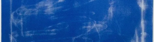
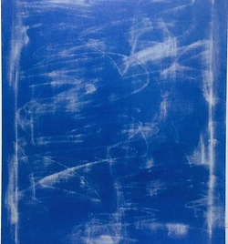
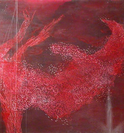
About 370km north of Scotland are the Faroe Islands. An archipelago of 18 islands, this territory of the Kingdom of Denmark boasts 55 thousand residents, rocky cliffs, rolling grass hills, and a little known artist named Rannva Kunoy.
Rannva Kunoy's art is deeply inspiring, and so I want you to inspire your next outfit from one of her artworks. I've provided a large handful of her art below for you to peruse. She may have more art on Google, however, I only want you to pick one of the paintings I provided. Her art style can easily be fed into an AI image generator, so I am only allowing pieces I have verified are genuine. You can pick any one of her paintings from below, and switch at any time prior to submitting. There is no limit per painting.
You may be wondering why I picked such a peculiar artist for this task, and that's a fair question. I want all of you to leave Snawlterm as better designers than when you entered, and I feel like Rannva Kunoy's paintings will help you build a greater appreciation for mixing items to create graphics. All of her paintings have a very limited palette, and so whatever you end up choosing, you will have to get cerebral with the shapes and patterns you choose, and how you shade them. This task is less about the articles of clothing themselves, and more about how you join them together with creative shading, and innovative uses of colour. Any two items can be "made into one" through appropriate colouring.

Welcome to your second panel.
Thank you for waiting patiently while I completed a spontaneous double shift.
Despite the large amount of frustrations echoed by the cast throughout this week, I must say, I am thoroughly impressed with the results. When I can barely decide on a Top 3, that's a good indicator.
I'll apologize now if some of my critiques read as sour or far-reaching. Because everyone in this game is so good and are all trying so hard, the gap between the highest 3 and bottom 3 isn't all that wide, and sometimes I have to rely on hyperbole or nit-picking to make my reasonings clear. This would be a pretty boring and confusing long-term if I just praised every single outfit and offered zero feedback. Unless you're the person eliminated, please just try to remain positive, even if you feel you scored far lower than you deserved.
Our first guest judge of Season 10 is a good friend of mine. His legend as a phenomenal designer is surpassed only by his status as an iconic long-term host, having hosted five of these himself! Give a warm welcome to Filip (Lidl-Wayne) who will be judging this panel alongside with me, as well as one more week in the future. Filip has not seen my critiques, and has been presented your outfits unlabeled. He does not know who designed what, or what my thoughts are on any outfit. This will remain true for all future guest judge appearances, too.
PANEL
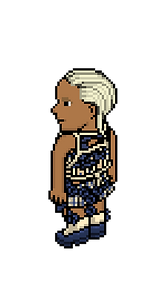
Becca (oyt)


Snawl: By far and wide, you are the newest person to Project Runway this season. Sadly, that discrepancy shines bright this week. This was a task about getting graphical; going all out with textures and/or playing with your outfit's silhouette, and I feel you didn't really do that. This is a cute outfit, and I really enjoy how you commemorated the triangles with the roaring '20s flapper. Your shading of the greens is also pleasant. Your overall layout, however, is quite generic, and is something we can expect to see in every short-term on any given task. What I'm trying to say is that you didn't harness the chaotic potential of this task. It's a nice outfit but it's not long-term worthy. You mentioned being inspired by the triangles; I wish you found a creative way to reflect those shapes by combining different items, instead of using items with triangles pre-designed into them. You basically played "match the shape to the hole" but with pixel clothing.
Lidl-Wayne: What a snooze, sorry but it really is. The original painting has an optimistic feeling to it, it resembles a small streak of sunlight that hits a green wall. This is just drab and the hair isn’t helping the case. Why not pair this with an ugly-chic jacket? Some shoes one wouldn’t expect? Or just have it be a dress? I’d like to see you experiment a little more with the heels as well, it would elevate this whole look if the heels were in *white, black, gray, navy blue or some sand color. The dark green is just too matchy matchy. (Snawl's Note: The contestants weren't allowed to use any colour(s) absent from their chosen painting.)

Marq (Aivn)

Snawl: So you crammed all your fabrics through a paper shredding machine and forced yourself to work with whatever was spat out? Honestly love that for you. You were one of the few designers this week who fully embraced the unpredictability of their painting. The two foundation pieces of this outfit are the top and the schoolgirl skirt, both of which bring a lot of textural value to the piece before you even start to consider accessories. The top half of your outfit is giving attitude, but your bottom half is a bit clunky in comparison. I think a more fitting belt that worked with the skirt instead of drooping off it would have served you better.
I don't love the socks & heels because when paired with the uniform skirt, it reads costumey- like you're on your way to an audition... in a blank white room with a brown leather couch, if you catch my drift. Besides that, I enjoy this outfit considerably. This was a task about embracing chaos and you stand tall as one of the more open-minded designers this week.
Lidl-Wayne: MMA fighter goes 18th century Versailles. I appreciate the experimental approach. There is an ironic quality to this design. The painting you chose is a beautiful mess, a melancholic chaos. The visual element is almost perfectly portrayed on your mini-skirt, but we see so very little of it because you have your own mess drowning most of it out. I’m amused and intrigued by the creative process that this piece hints of, the look itself not so much.
Alan (Alanio)
Snawl: My initial reaction upon seeing this outfit was "omg where are the white smudges!?" but as time passed, I've certainly warmed up to your artistic vision a lot. The subtle blue hue shift on the heels tell me you didn't misunderstand this task, you knew exactly what you were doing. There is a powerful confidence that radiates off this outfit and I love that. I was confused at first by your choice to add four circles on your torso, but now I see the outlines of those circles as a sort of reflection of the white brush strokes on the painting. Leaving the rest of your upper body totally absent of items and accessories was another stroke of genius. This outfit looks so unadulterated and pure. The only thing I would change would possibly be to use the version of those pants that aren't trimmed down the side? Regardless, I find this outfit to be really impressive. It is entirely original, while still having that undeniable Alanio essence to it.
Lidl-Wayne: This is kind of hilarious - not because your model is so half naked but because the whole attitude of the look is so ‘’you will eat what I tell you to eat’’. I believe the silhouette is what carries the whole look - the individual details are not that interesting. I adore the fact that you went with shoes of lighter blues, they are gorgeous. As this design doesn’t really resemble the painting that much, this was a missed opportunity to experiment with textures, shades of blue and prints to come up with something outside of your comfort zone.

Arber (icearbr)

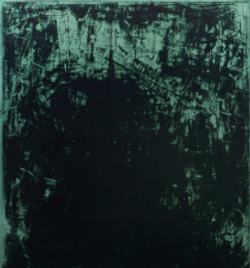
Snawl: If I were judging these outfits by themselves without any relation to the paintings, this would probably win the week. This is an astonishing maelstrom of body paint, furs, and bejeweled flesh that come together as otherworldly, fantastical, and fierce. Your meshing of the green shades to create this almost 3D colour palette near your Habbo's neck is its own masterclass in how to effectively shade a region. Sadly however, I think you missed the point of this task. Your outfit features several shades of green that are completely absent from your painting. I was considering looking past that flaw at first, but as more and more outfits trickle in, it stands apparent that you're the only one whose outfit has this flaw. If I were you, I would have posted this outfit in the server to showcase your undeniable talent, before focusing on designing something far more in line with the task and submitting that instead.
Lidl-Wayne: Out of context, I love this. It’s beautiful to look at. In relation to the fact that this is Project Runway - a fashion competition, this is a look I cannot judge. It’s a costume.

Kyle (KSkins)
Snawl: The shape of this outfit is rather simple, but I find myself to be completely in love with your graphics. I am especially drawn to the nearly pixelated effect on your shorts. The head accessories are a bit silly but I like the flow of blue they add; the outfit is stronger with them than without. Even though you can't see the animal print vest too well, I appreciate its addition because it breaks up the upper body and stops it from being too rote. This is a much better and more dynamic outfit than your last submission. Despite being one of the newer players to Project Runway, this outfit tells me you're not afraid to be adventurous. I don't like the winged sandals but they're not all that noticeable so I can forgive them. Great job this week, a solid rebound. I am excited to see where this competition takes you.
Lidl-Wayne: The outfit itself is pretty great - there is a variety of prints and there is a synergy between. The graphical shorts are quite unexpected and fresh. Overall the textural work you have done is pretty impressive. The styling is horrible. Glasses, hat, hair, the shoes - it all needs to go. I’m assuming you tried to sell this as being a nude illusion. Nude illusions are quite tricky and this was not a successful attempt - not that it affects your design.

Elysse (LC22)

Snawl: The manner in which you used shiny and fuzzed out textures to convey the smudged ink from your painting is nothing short of astonishing. I am choosing to interpret the scarf not as a literal scarf, but a clump of flyaway fabric detaching from the upper torso, as that makes far more sense in the context of your chest graphic. The tight norm skirt is sickening and is such an underappreciated item in general, and I can't think of any better item you could have used, retro or otherwise. Then of course you have the running shoes, which are a flawless pairing because the outfit had an essence of sporty couture beforehand, only now it is undeniable. Like last week, this is an amazing outfit that I did not expect to be turned in by you. Even though you have your own established colourful style, you are showing your talent for adapting any task I throw at you into something cute but high fashion. You could not have done a better job this week.
Lidl-Wayne: This is so heavily layered and yet there is a light, flowy feeling to it. I adore how each layer has its own texture story. I’ve said it before and I will say it again - there are few things I love more than designs which are complex but come across as more simple. The choice to go with an uncomplicated, sporty and slightly unexpected sneaker elevates this design. Superb work.

Elobstabeth (lobsterbiscc)
Snawl: Interesting... I think you were on the cusp of something special with this idea, but like I said during your outfit advice session, I feel the upper half of your outfit reads a tad bit incomplete. I know you have limited access to a PC and thus couldn't edit it, and that's really unfortunate because I believe you could have taken this outfit from merely interesting, up to the next level. Your foundation however shows tenacity and budding brilliance. I like how the feather and stuffed bunny kinda look like a dramatic train or long cape dragging behind your outfit, and that illusion is helped by the position of your hand. A dress or gown definitely would have hammered that idea home better than the red pants. Overall I like the direction you took from the painting, I just wish your concept - whatever it was - was fully realized. This cake definitely needed more time in the oven.
Lidl-Wayne: You had a concept and the guts to go for it, for that I applaud you. The elements do not blend and the result is a bit of a mess. The white socks are just too jarring. Had you actually played with movement I believe the feather belt and the bunny could’ve become something fantastic. Excited to see what you do next.

Sarah (Sparkle)
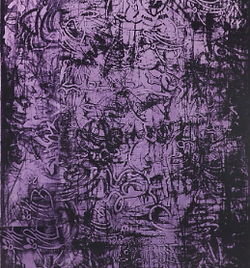
Snawl: I've warmed up to camp over the years and I really like it when someone designs something Avant Garde, but also has a cohesive vision and isn't just wild for the sake of it. Fortunately I find this outfit threads that needle very well. The cohesion between your outfit and the chosen painting is as clear as they come. The furry protrusions jutting from your outfit's silhouette are great encapsulations of the painting's scribbles. My favourite part of this outfit is actually the lower half, because the gown and kitsune tail create a rather otherworldly black gradient that we're not all that used to seeing. To parrot Filip, I do think a more inventive use of purple shades could have been the thing to take this outfit from great to legendary... but regardless, you've made two solid outfits in a row. Keep up the good work.
Lidl-Wayne: It’s abstract for sure and the drama of it is captured by the silhouette. There’s a subtle shade over Rannva’s painting that might go lost on someone who simply glances at it. Notice how the purple in the top corner is different to the purple at the lower end. This design would’ve been elevated had you played with shades of purple the way Rannva does. Your approach results in a look that feels a bit flat. I’d like to see you step outside of your comfort zone a little, this feels a bit too easy for you.

Peyton (Peyton125)

Snawl: I thoroughly enjoy the top half of this outfit. The idea of bedazzled skin and loose, ribboning head accessories gives a very glamorous, almost party-like quality to this piece. It's not something we're used to seeing in these competitions. The bottom half of this outfit, however, is where the good will starts to fade. Those large boots just don't go with that short norm skirt, in my opinion. The proportions look like Lego. I also didn't love your choice of belt. The way it curves on both ends just seems a bit too unnatural on a model who I'm made to believe is topless. Smarter fabric choices would have propelled this outfit higher for me. However, your vision is strong, creative, and I like the direction you took with the colour palette. Decent outfit but it doesn't blow me away. I really wanna give you a nice, big, high score in this competition, but smarter fabric choices and more daring silhouettes need to happen first.
Lidl-Wayne: The hair decorations that extend across your model’s arms are gorgeous and I wish you had taken that route with your outfit fully. The darker teal elements feel like something else. I’d like to see more synergy between the parts.

Lusealiya (SealChowderr)
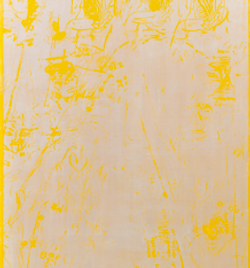
Snawl: I wasn't sure this was your official submission or not, you tossed it into my inbox and said nothing, not even hi. I was left confused and ultimately had to guess that it was not a prototype but your final submission. The smallest bit of acknowledgment would have went quite a long way. You design such great outfits in my short-terms and Miniterms, but this outfit looks rushed and without a vision. In fairness, you did pick a very difficult painting, but it's hard to believe you weren't inspired by the splotches, the drama, the creamsicle gradient? You just thought it deserved a white outfit adorned with marigold accessories, and shot from the side - something I criticized you for last week? Alright then. I do like the sunglasses and evening gloves, they have a timeless diva vibe to them. Everything else is forgettable. This doesn't represent you at your best.
Lidl-Wayne: Too plain and far too safe. I enjoy the attitude the glasses bring and wish you would’ve explored that more.

Mickey (Player)
Snawl: This outfit has a graphical, almost dripping effect that I find totally engrossing. I love the square tiled pattern on top, and the vertical lines on the sides of your pantlegs. This outfit is very geometric, but it doesn't read as stiff because you have just enough motion on the belt and scarf (although I am choosing to see the scarf as part of the pants.) Normally I love bald, but I wish you used a hairstyle just to add some grounded personality and make the presentation look more like a wearable outfit instead of concept art. Regardless, this is a gorgeous submission. Using that scarf with a checkered top is something I've seen several times before, but your rendition is very tasteful. I love your decision to focus on the darker mass on the painting, and duplicate it in the center of your mass. You held this task to the fire and I love what you ended up with.
Lidl-Wayne: Unsettling. It makes you feel a bit uneasy and for that reason I love it. Fashion that makes you feel or think about things is fashion that has achieved its goal. The water drip effect on the skirt is great. This design is more complex, but what makes it an excellent design is your way of playing with colors.

Nicole (nicrobbo95)
Snawl: There is a very subtle addition of black in the center of your showgirl top that is almost invisible to anybody not super familiar with the item. But it's that black addition that helps orient this outfit towards being an original creation. Granted, you maybe could have gotten a bit more adventurous with the black in the center, but it was better to air on the side of caution. I like the sharp edges of the overcoat that makes me think of the edges and texture of paper. This outfit is operating on a lot of subtleties despite its grandiose shape and stage presence. Had you gotten a tiny bit more daring with smudging greys and black, I think this could be a winning outfit. I know overthinking can often result in "safe" submissions, so I think you need to level up your confidence if you want to be taken seriously as a huge threat in this game. I've seen you do it before. Regardless, pretty good effort.
Lidl-Wayne: I absolutely adore this. Let’s get one thing out of the way: you captured the color story of the painting but not so much the feeling of it. This is more cheerful and cheeky. The eye-makeup is one of my favorite things I’ve seen in PR for a while, so painfully fabulous. The jumpsuit underneath the coat is something I’ve never seen before because you have uniquely made it your own. I love the subtle parts of black which add a bit of texture to a lot of white.
.png)
Rae (saffrons)

Snawl: You woke up and declared DEATH TO SUBTLETY. This is the type of risk-taking and boundary pushing I can always appreciate, even if it isn't pulled off 100 percent. Luckily for you, I find most of this presentation not only tasteful, but I see some clear indication markers that tell me you've grown substantially as a creative force since I last had you in a short-term. My favourite part of this outfit are the tail feathers from the showgirl attire. The vein-like texture pairs immaculately with your chosen painting. The rest of the showgirl top is a bustling festival of lines and loose texture that adhere to your upper body in a way I've never seen before, thanks to the innovative posing of your model. The only part of this outfit I'm not totally vibing with is the robotic element. It's cool but I feel it hurts the presentation you were building with everything else. Regardless, I definitely don't hate it. I love this edgy rebirth arc you've been on since FF3.
Lidl-Wayne: I got a bit more energy looking at this. This is a bit of an unusual color palette and for that reason it was a great source of inspiration because it automatically makes the outfit more interesting. Although this design is rough around its edges and could use a little editing, I find this to be exciting and refreshing. It tells an abstract story and it takes you to a place. It’s also avant garde. Definitely one of my favorites.

Well done to the thirteen of you for turning out some very creative pieces. Once again I had a difficult time focusing on only three to commend, but ultimately I have to go with Alan (Alanio), Elysse (LC22), & Mickey (Player) for this week's Top 3 roster. As for the winner, for me, it's gotta be Elysse (LC22). I feel like this outfit gave me exactly what I had hoped for when I originally conceived of the task. Well done, you three! You have upped the ante.
Week 2
Top 3


The Bottom
Three of you slipped through the cracks of this task. Those three are. . . .
Becca

This outfit's cute, but the simple shape reads less like a runway outfit inspired by Rannva Kunoy, and more like late '90s casual night out wear.
Arber

You're probably confused to see yourself down here, but I take rules very seriously, and you're the only contestant who didn't adhere to their strict colour palette.
Lusealiya
If someone said this outfit represented you at your best, I would slap them across the face and insist they had the wrong Seal.

The Designer I Am Eliminating Is...
[Highlight the text to reveal]
Lusealiya (SealChowderr). I am sorry to do this to you again so early, trust me that I really didn't want to. However, I found your outfit this week to be oddly uninspired, which is not what I have come to expect in these high-stakes games. There is $70 on the line for first place, and that outfit just wasn't it. I hope this elimination doesn't effect your patronage in the Miniterms, or any short-term you can catch. We all love having you, and I know that you'll be cheering on & encouraging Lob like the awesome friend you are while she continues down the path of this competition. Thank you for agreeing to play, and for helping me get in contact with Lob, too. Swim on, my Seal.
Well done to those of you who survived. Like I said last week, I don't care about track records. Any of you could win or get eliminated in this next task. Please be on your toes and don't be afraid to take that extra leap forward to give your outfit that edge it needs to stand out from the crowd.
Your third task is uploaded, good luck.