


TASK #3
Nobody Likes
Bad Head
Okay kids, gather around.
It's story time with Uncle Snawl,
Let me paint the picture: It's Week 2 of Lidlterm Season 2.
The task is the infamous James Bond week. I have no idea what to design.
I rack my brain for days, I can't think of anything. This task felt impossible.
The deadline was approaching rapidly and I was starting to panic.
I still had nothing. Every outfit I began designing didn't work out.
With nowhere else to go, and nowhere to turn, I decided I was going to do the one thing I knew I was good at -- the one thing I knew Filip would appreciate from me more than anybody else..... I gave Filip head!
Filip loved the head I gave him so much, not only did I not get eliminated, but I ended up winning that week's task! Definitely one of my proudest moments in a long-term. Now, whenever I'm in a long-term, I always make sure to give the host -- whoever they may be -- some great head.
For this week, I am going to teach all of you how to give great head, too.

Lesson 1: Angles & Poses
You can give head to any PR host, long-term or short. But in long-terms, we can use angles & poses in very intricate ways to create results that aren't achievable in short-terms. Take a look at the bull horns below. In the first picture, they look ridiculous. They look like the last item you'd ever use in a PR. But in the second picture, I use a different angle to make them easier to work with.

These horns suck!

...but wait,
this angle is easier...

Woah, now that's some nice head
Taking a photo of your Habbo mid-jump, wave, or dance, can put a non-head item near your head, too.

This rabbit is clearly not a head item...?

jk now it is

argue wit'cho mama
Lesson 2: Combining Items
Most Habbo head accessories are boring. In order to give good head, you have to "create" your own accessories by stitching two or more items together. This, in combination with posing, opens up near endless possibilities.

I hate this tacky vine. Let's make something with it!

yawn

sure, let's try it

Okay, this shape is new! We can make something original with all this.
Lesson 3: Hair
When hair is given an unnatural colour, it can be blended with other items to give the impression that the hair is actually fabric, or a synthetic item.

Snawl (Lidlterm 2, Week 9)
Time for your 3rd task!
As you probably guessed, I'm not telling you all this for no reason. Your next task is to give me some great head! Use the three aforementioned steps above to show me what you have learned. You do not need to use all three lessons in your outfit. All I am asking is that you design me an outfit wherein the head portion serves a vital purpose and adds spice to your outfit. I want you to show me something I've never seen before. Don't just slap on a hat plus one accessory, that's not good enough for this competition. Design me something unique that looks intricate! Your head can be cohesive to the rest of your outfit, or, it can contrast entirely. The choice is yours. Your entire outfit will be judged at panel as one whole art piece. Head plus body.
Welcome to Panel #3.
Thank you all for doing your best in treating me to the best head you could deliver. Some of you gave some truly mind-blowing head, while others may or may not have fallen back onto more common techniques. Either way, as a cast, you guys really knew how to make me feel special. I will definitely look fondly upon this moment as a kaleidoscope of technique, risk-taking, and passionate head.
Something else I wanted to say (I've touched on this before but it's worth repeating): Most of you are veterans in this community with vast bodies of impressive work. Most of you aren't used to the idea of being eliminated early in a long-term. Unfortunately, you guys are going to have to get comfortable with the thought that it may very well happen to you. This game is very competitive, and you can't all survive every week.
Your next guest judge on the docket is none other than Snawlterm Season 8 Champion, Zoetic (Slur)!
Like Filip last week, and every other guest judge going forward, Zoetic has been given all your outfits completely unlabeled and does not know who designed what, nor do they know any of my thoughts.
PANEL
Sarah (Sparkle)

Zoetic: I like how you used a lot of unconventional items here paired with unconventional colors—I can only identify one or two of the items used here, which I think is cool. Beyond that, this outfit feels a bit disjointed. I don’t fully see where the headpiece is incorporated in the look, or where it otherwise adds to the look in a meaningful way. The headpiece and the outfit look like two entirely separate entities, which wasn’t what the task called for.


Snawl: The spontaneity of shapes and edges surrounding your head is very stunning. I love the bright red & pink, they're as bold as the items themselves. I'm definitely willing to suspend my disbelief and ignore the string from the balloon, that's not a problem. There is a charming, almost anti-art, sarcastic charm I get from the sneakers on an outfit with such an Avant Garde shape. It's like "let's offend the streets as well as the Paris runway shows!" I'm not completely sold on the middle portion of your Habbo's body. I like the colour and I agree that leaving it bare of excess accessories was a great idea. I don't know, I guess I just expected the shorts and top to be joined better...? Either way, this is a pleasing submission. You gave me some lovely head.

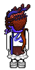
Kyle (kskins)
Zoetic: The headpiece is really cool and innovative. It’s definitely a risk and not something that just anybody would think of. For the outfit itself, I wish there was more. I do like the autumnal colors and the slouchy vibe, I just want more. If the outfit had some of the same interesting details that the headpiece does, then it would definitely be up there in the contenders for me.
Snawl: So much drama, it looks like you're mid-photoshoot as a wind machine is aimed your way and blasting you on full dial. I love that effect! Admittedly your use of the stuffed rabbit doesn't scream originality at me, seeing as I showed it to all of you in an example. However, your command of the retro items, as well as usage of the hair as a fabric, are all really gorgeous, and they dance around the bunny with effervescent glam and attitude. Keeping your colour palette simple and analogous was also pretty smart. I like the fabric you used on your torso; it's this sort of primitive looking, indigenous pelt from a bison fusing with the baggy pants. Then the heels save the outfit from being too lost in the past. This is a very wacky outfit with a specific vision, and I have a feeling I'm going to enjoy it more than the average person. Whatever, you impressed the one person it was most important to, so well done!

alan (alanio)
Zoetic: I feel like you could have used the hair to somehow add on to the headpiece or extend it (which was mentioned in the task prompt), which is kind of a missed opportunity. I will say that in an isolated bubble, this is a pretty cool look. Admittedly, this is partially because grey is my favorite color at the moment. I also like how you used a lot of .com items, which is something that can’t be said for a lot of your fellow competitors. It’s refreshing to see that. However, this look for this specific challenge isn’t a winner by any means.
Snawl: There are a lot of aspects to this outfit I like. I love how your hair looks like it's flopping out of holes in your headpiece, rather than being tied in a bun and hidden. It adds a sort of punk-pop rebel aesthetic that is hammered home further with your pink & purple heels. I love the grey print pattern on your floral gown, and your upper body has a simple but very pleasing graphic. The sleeves, ascot, and silver fur are helping give this outfit a loud presence despite its simple layout. My only issue with this outfit, is that the head accessories themselves aren't all that special. It's two black items and a veil. It looks nice, but for this task, I think I was looking for something more grandiose. I know it must have sucked when I told you your first prototype was too fabric heavy, and I appreciate that you toned it down for the runway, but perhaps you could have kept some of that spunk on the final product.

arber (icearbr)
Zoetic: I love it. Cool, experimental, interesting, almost grotesque. The way you were able to incorporate those purple and orange tendrils from the head to the body is exactly what the task calls for, and you did it in a way that feels resolved. I really can’t think of much more to say than superb work—I believe you did exactly what the task calls for in a way that is original and thought-provoking.
Snawl: Very conceptual. I love how the head items all have this sort of fluidity to them; like they each represent a hue of paint that has just smacked you upside the head, and then froze mid-frame. It's a brilliant example of what can be achieved when you turn your Habbo's head to the side and take the time to experiment with different items at different angles. I love the blinding white below, it only helps the splatter accessories shine even brighter. I don't fully get the gown you chose but it definitely isn't hurting your presentation. The Nike logo feeding flawlessly into the swooshed shape of that bikini top is magical. The blue handbag and torrent of red retro hair are interesting but I think you should have picked one over the other, instead of keeping both. Otherwise, this is a stellar submission! Very well done.
elysse (lc22)
Zoetic: I really like this. I will say that my main criticism for this look is that I am so beyond TIRED of seeing those chains, in that pose, paired with that belt. You are not the first, second, third, fourth, or tenth person to do this or think of that. With that out of the way, the stripe motif throughout the look is something that I am a huge fan of. What can I say, I love stripes, and using that poncho in that pose adds a nice drapery that is further mimicked on the drapey, layered skirt. Strong work—I can't wait to see more!
Snawl: This outfit is hard to judge.
I find it captivating, but simultaneously a bit underwhelming. It's definitely better than your first prototype. I like the shape you achieve on your head with seemingly only two items, the crisscross of the fabrics look like a boat's propeller. Your explanation that the cape's sleeve and chains are "attached" to the head region and sagging down is definitely inventive and helps shine a brighter light on what it is we're looking at... but for me, it's all a bit convoluted. My favourite part of this outfit is actually below the waist. The layers of fabrics on the gown and your footwear photographed from the side looks very fluid and gracious. This is a daring outfit that proves to everyone that you're one of the most creative minds in the business, but I feel like the head items are the weakest part of this outfit.

becca (oyt)
Zoetic: Idk this just feels like a CC old lady look to me. I don’t see how the headpiece adds to your outfit. There could have been a cool idea here with using those long tendrils and incorporating them into an interesting outfit, but you didn’t. Missed opportunity. I think this is my least favorite.
Snawl: Like last week, I feel the stakes of this competition have towered too high above you. This is another outfit that - while featuring some neat ideas - falls completely flat when compared to your fellow competitors. I can respect that you design outfits fully immersed in your practical style that is true to you, however, I need to be convinced on a weekly basis why you deserve to advance. Your head accessories don't come across as an inventive ensemble of items, nor am I being shown an original idea or shape. It's just a black hat, adorned with gray trinkets. Your original prototype, while far from amazing, was far more creative, and it actually used the sideways pose purposefully with showing off interesting texture. This newer version does none of that. If it weren't for the head details, I would think this is just a normal dance leotard with a tutu.

marq (Aivn)
Zoetic: I don’t see this as an outfit, but more of a sculptural art piece that is rigid in structure, which isn’t a bad thing. The headpiece is beautifully impractical. The laying you did on the outfit itself is nice—I think with some slightly different coloring it could have felt more incorporated. Fair work!
Snawl: Firstly, I am beside myself over this colour palette. This is my favourite palette from any outfit in a very long time. The spots & stripes on the large scarf play brilliantly against the geometric cultural robe. I love the bulky, scrunched shape of the footwear too. Your headpiece is really cool on its own, but in tandem with the outfit, it reads a bit too far into the fantastical realm. Instead of a sci-fi helmet, I would have loved to have seen 2-3 common items blended into a new shape; something to give your model an edge while not taking them completely off the runway. Your outfit from the neck + down is astonishing and it really didn't need this sort of Fame Monster era "I reproduce asexually and shit bioluminescent larvae" tone you ultimately settled with. That being said, everything works strong as an art piece. I've enjoyed looking at this outfit, and I appreciate the risk taking from you.

peyton (peyton125)
Zoetic: This is like the hell version of the last look. Overall I think it’s neat, not something that I would consider for a win, but I appreciate whenever someone goes for a strong punk/alternative aesthetic in this competition. It’s so easy to get lost in flowy, beautiful gowns, that seeing something more graphic can be refreshing. Overall, to me, this one is just decent.
Snawl: Boom. Peyton's arrived.
I totally adore everything about this. I clicked on your Habbo while I photographed you, just to see how you achieved the head effect, and it actually confused me even more. Using the backside of the Spiderman mask to give yourself this anonymous, sort of couture fencing student turned evil aesthetic is nothing short of brilliant, and it's framed with outrageous accessories whose bilateral symmetry is very tasteful and doesn't look gimmicky or cheap. The wings photographed from the front give this weird shingled fur texture that I've genuinely never seen before in my life (at least not conveyed this successfully.) Then there are the shirt, pants, and shoes, all of whom are simple in shape but are very graphical; they abandon the symmetry of the top and sort of form their own little islands and crevices at will. It makes me want to zoom in and analyze every inch of your outfit. This is some fantastic head!
rae (saffrons)
Zoetic: This ethereal, dreamy aesthetic is pretty cool, and I love the gray elements you were able to wrap around the whole thing. I get just a tad bit lost once you add the sparkly tights and the stars/sci-fi motifs on the head. If I’m just looking at the body and not the head or the legs and feet, this is absolute perfection. It's hard to make that dress look good because it’s so restrictive in the contexts it can be used in for some people, so good job on pulling it off. I’m interested to see more from you.
Snawl: This is actually really cute!? Like what. Those clusters of fluffy grey fabric are to die for, and I love the untouched creme top. It's like a sexy nightgown repurposed for a Harajuku collection with pastel colours. The heels are great, the decision to leave the legs visible is also great. There is no attention being robbed from the top half. Then we get to your head. I love the use of makeup. You're using blush, lipstick, and eyeshadow to add colour to the face - an area of your Habbo's canvas people often neglect, and the whole point of this task was to unlock potential where it is often forgotten, and so you aced that test.
I know a lot of people hate headbands on Habbo, but I find your twinning headbands to be quite charming and juvenile; not in a tacky way but in an ethereal, dreamlike way that hammers home the bedtime aesthetic of this piece even more. This is unlike anything I've ever seen, and I never in a million years would have ever tried to design something like this... but I'm very grateful you did!

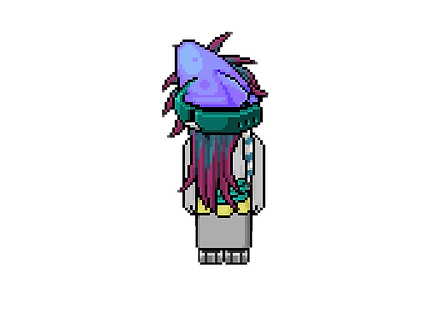
mickey (player)
Zoetic: Yall will just wear anything now huh? JK, but I can honestly say that I haven't seen anything quite like this in my 13+ years of Habbo PR. It's interesting for sure.
Snawl: These Seapunk colours and textures are very pleasant and well executed. I'm glad the hair is playing a vital role in the silhouette of the top half. The colour gradient is nice and I love the aquatic tone with the squid hat and concave turquoise accessory and how it caresses your head. The rest of your outfit is also pleasant and coloured very satisfyingly. However, I can't help but feel the bottom half of this outfit isn't singing as loudly & as proudly as the rest of the presentation. Normally I'm never the guy who opposes minimalism, especially when the top half is so detailed. However, given this particular week and the inventive silhouettes we're seeing from your fellow competitors, I definitely think the bottom half of this canvas could have been used to give your outfit more of a stand-alone, je ne se quoi element to push it into the next echelon. Overall a nice submission, just not spectacular.
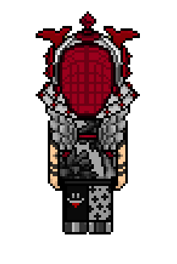
nicole (nicrobbo95)
Zoetic: This is alright. I like the idea of the hair for that outfit, I just wish that the hair looked more like it was A PART of the full outfit, rather than an extension of it. The layering is pretty neat and I like the colors. It's not revolutionary but it's fine.
Snawl: The idea to go monochrome with your head accessories is smart;
I love the chaotic, almost festering quality to the red. The sideburns may not be the most original item in the world, but the way they're being incorporated is great. It shows technical prowess. The use of the horns is equally pleasing. Your gown is beautiful and I appreciate the motion pose to give movement to the bottom half. However, like your previous outfits, I feel like the core of this outfit doesn't have that original flare or central draw that makes me want to pause scrolling and stare at this piece for longer than five seconds. Head accessories aside, there isn't really anything about this gown that separates it from any other gown seen in any Project Runway, long-term or short. I know for a fact that you're pouring a lot of time, effort, and creative soul into your submissions this season, however, I do think you may be suffering from overthinking. Your need to make sure everything fits perfectly is interrupting your ability to experiment with uncertainty, which is what is needed to create that truly remarkable outfit.

That's a wrap for Week 3! Some very exciting outfits submitted once again that made judging this week a treat, and picking a Top 3 to be difficult. The three outfits I am commending this week were made by Arber (icearbr), Peyton (Peyton125), & Rae (saffrons)! All three of you did amazing and deserve this win. Ultimately I am going to settle with the person who really pushed the boundaries the hardest in terms of using their head canvas for maximum effect, and that person is Rae (saffrons)!
Week 3
Top 3


Lobsterbiscc has refused to give me any head!
Elobstabeth (lobsterbiscc) . . . Due to the absence of a submission and your continued ignoring of my messages, you have been disqualified from Snawlterm Season 10. As promised, I am going to bully you a bit... but I'll go easy because I still like you as a person and I don't want to actually cause you any anguish.
You were very excited to play this season. You even stayed online while the first two panels went live. Then something happened that made you lose interest entirely. That "something" I am assuming is the results of last week's panel, in the elimination of your best friend, Seal. With all due respect, what the hell was I supposed to do? Push her through even though she designed my least favourite outfit? Come on... That fraudulent philosophy is not who I am as a host. Sorry to disappoint you.
After you won Week 1, I turned to one of my co-judges and remarked (rather unseriously) that you're going to quit now that you have a task win. Shame on you for being so predictable. One of your competitors remarked in my DMs that your win on Week 1 was a total fluke. I told them to not under-estimate you. It appears that in reality, I over-estimated you. Was it a fluke? I guess we'll never truly know.
As for the 11 of you who actually submitted, thank you for your hard work, and thank you for not disrespecting your fellow contestants by making them wait for an outfit that was never coming. You each have a 1/11 chance of being a Snawlterm Champion, which shall I remind you, comes with a prize of $70 CDN.
Your 4th task is up.