

Menu
Task #11, pt. I
. . .Panic Bells, It's Red Alert. . .

In every season of Snawlterm, the penultimate task has always required the submission of two outfits. This is because the talent at this stage of the game is so compact; judging two outfits (usually) makes eliminating someone much easier. Unfortunately for you guys, Season 9 will not be an exception! You'll be given two tasks to complete before the deadline. These two tasks will be weighed an equal 50/50 at panel, meaning you can "win" one task and still be eliminated if your other outfit is lacking. Your final ranking will be determined by the average between your two submissions. Here is your first task:
If you know me well, you know I love cinema. Films are one of my main passions - far greater than fashion (or anything internet related.) One of my favourite elements of filmmaking is cinematography. Even if I'm watching a bad film, I can sometimes still appreciate the beauty in its camera movement, shot composition, use of colour, item geometry, perspective, all things that can be enhanced by a great cinematographer.
For your first task of Week 10, I have provided a YouTube video below which celebrates the colour red in cinema. Your job is to watch the video, and pick a scene that'll inspire your next outfit. Like your Week 4 music video task, you don't have to summarize the entire scene in your outfit. Red is the focus of the scenes in the video, but you can use as little as you want in the outfit. You need to have some red, but it can be as sparing as 5%, so long as it provides an integral visual element to your outfit and doesn't look like an after-thought.
"The Most Beautiful RED Shots in Movie History"
The Solomon Society | April, 2017
Panel #11

Hello final four, and welcome to your last panel before Fashion Week.
I asked the four of you to bring it in this two-part task, and you guys certainly did. An attribute I've begun looking for with designers in recent years is personality. I love designers who nurture their own styles, and who create pieces that are unapologetically them, while also challenging our preconceptions of what they're capable of. In other words, Habbo's best designers design outfits that are both unpredictable, yet recognizable... for my money any way. This is a delicate balance that the four of you have achieved throughout this season, and nowhere is it shown more proudly than in these two tasks. Regardless of how this week plays out, all of you are certified winners in more ways than one.
Arber (icearbr) will be assisting me throughout this final panel.
Enough happy-go-lucky, feel-good syrupy sweetness. Time to rip apart your guys' hard work! *pours non-alcoholic smoked jalapeno margarita*
Part I

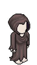
Joey (Jozinga)
2001: A Space Odyssey
1968 | dir. Stanley Kubrick
A group of scientists set out on a voyage through space to investigate a mysterious black monolith. Later, another crew of astronauts on a nebulous mission begin experiencing trouble with their on-board computer system, HAL 9000. This forces the crew to improvise, leading to an intense showdown of man vs. machine.
.png)


Snawl: I'm grateful you resubmitted because this version is a lot more polished than your previous one. By eliminating the excess red on the chest, you are allowing the large scarf to serve its role without commandeering the entire outfit. It's a small change but it achieves a lot (click to see.) The rest of the outfit is just as gorgeous. The subject in your film's frame is looking at a server computing room, and the cold, lifeless technology is reflected in the man's helmet. Your outfit's lines & choppy graphics allude to that desolate lifelessness flawlessly, while at the same time giving life and showmanship to it. The burnt orange on the underlayer, and the smearing effect on the skirt are beautiful ways to help reinforce the scarf without oversaturating it. The face mask and Liv Ullmann headband are great too. No criticisms worth mentioning from me, this outfit is near flawless and possibly your strongest yet in this competition. Way to turn up at the end!
icearbr: The textures and colors in this outfit are absolutely captivating. The play on hues creates a sense of depth and dimension that is truly mesmerizing, especially the small sections of darker red, which add a touch of intensity akin to blood on stool. The way the mask and scarf blend seamlessly together is nothing short of genius. It's as if they were made for each other, like dried scab clinging to skin. The way this outfit channels the movie snapshot is both daring and inventive, pushing boundaries, especially with how you could easily replace the movie shot with a picture of an anal canal showing tearing and blood leaking. It's the same vibe really.


Elysse (LC22)
We Need To Talk About Kevin
2011 | dir. Lynne Ramsay
Tilda Swinton is Eva, a mother who struggles with guilt over her inability to bond with her difficult son. When he grows into his teens and begins exhibiting psychopathic tendencies, Eva must confront her longtime suppressed grievances when it appears her son has committed an unspeakable atrocity.

Snawl: The manner in which you commemorated the loud splashes of red is very original. I love how you positioned your bedazzled arm above the lower red section of the celestial vest. It created a very enticing pattern that, with the shoes and back-pack straps, tells a wholly unique way of dripping paint. The idea to highlight yellow by brightening it was unexpected but I love it. This is just as much an Elysse outfit as it is a WNTTAK outfit. The theme of the film's frame isn't dictating the outfit, it is merely an inspiration, and I appreciate that distinction. The whites, grays, and raceway pattern fabric on the dress are fierce and modern. Even the gas mask and toque (beanie outside of Canada) add a fiery edge to the outfit that doesn't feel tacky or ham-fisted. Even though I said I appreciated the graphic conveyed by the celestial top, I feel like the item's vertical nature impedes the outfit in other areas, mainly the left side and how it just sits on top of the interesting details and stops me from enjoying them (and cuts through the skirt.) That's my only critique of this otherwise stunning outfit.
icearbr: The chaotic take on this outfit is surprisingly effective, conveying a sense of repressed rage in its disarray. It's as if the fabric itself is on the verge of unraveling, mirroring the turmoil within. The glitchy appearance adds another layer of complexity, suggesting a fractured psyche struggling to maintain composure, much like stinky genitals fighting against the onslaught of gonorrhea. The choice of yellow is inspired, melding with the bold reds and the neutrals to create a harmonious yet daring palette. It's a burst of vibrancy amidst the chaos, like a ray of sunlight cutting through the haze of toe fungus. But perhaps what I love most about this outfit is its attitude. There's a palpable sense of defiance in every stitch, a rebellious spirit that refuses to be tamed. It's bold, it's daring, and it's utterly unforgettable, just like a lingering hint of dick cheese in the air.

Filip (Lidl-Wayne)
The Red Shoes
1948 | dir. Michael Powell & Emeric Pressburger
Vicky (Moira Shearer) is a prodigal ballerina hopeful whose dream of becoming a world class act seems to be imminent when she joins the renowned Ballet Lermontov school. After developing a romance with the school's composer, her strict instructor forces her to choose between her love of the art, or whom her heart desires.

Snawl: There is a toxic mind trap that plagues a lot of otherwise talented PR players: the idea that every item slot needs to be filled. It's a sin even I commit at times. I don't think anybody has avoided it with as much proficiency as you. You routinely design intricate, jaw-dropping outfits with as little items as possible, relying instead on movement and textural composition to add drama. This outfit epitomizes that; I haven't been keeping score but this may possibly be the best outfit of Season 9. I'm literally CUMMING BUCKETS over here, my laptop is drenched! Everything from the muted, gentle colour palette, to the airy draping fabrics, to the lithe movements akin to the most practiced ballet dancer, to the two-item graphic feature of red below the waist, it's all masterful work. The cape is cutting off just enough of the skirt + handbag to where it gives the illusion you're using an original item you designed yourself pixel by pixel. Flawless.
icearbr: This outfit is simply breathtaking. The weaving of colors, textures and layers creates a truly stunning ensemble that captures this essence of romance, akin to the delicate unfolding of a rosebud amidst a backdrop of anus. Every little detail is so delicately created evoking elegance and allure. The layering under the cloak is one of the best I've seen this entire season, with each fold and tuck resembling the intricate folds of a prolapse. Everything about this is just so beautiful. The overall presentation creates this mesmerizing idea of movement, it's almost like a dance, or a fart in the wind. In a season filled with stunning creations, this outfit stands out as truly exceptional.

Chris (doglover)
John Dies At The End
2012 | dir. Don Coscarelli
An impending, silent, otherworldly invasion threatens all life on Earth. The only people who stand a chance at saving humanity are Dave & John - two deadbeat college flunkies who use a new dimension-hopping drug called soy sauce to access psychic powers and thwart the inter-dimensional intruders.

Snawl: Your firm control over this outfit's colours is really quite spectacular. Is there a single hue in this frame that isn't somewhere on your outfit? That's a dangerously tall order to fill but that tenacity is what's needed to stand out. I don't know if it was intentional or not, but I really appreciate the way in which this outfit's fabrics fall down; they resemble the drooping fabrics on the Feng shui laughing Buddha statue to the right. Despite looking like an array of colours, a large portion of the upper body is actually monochrome, which is just a testimony of your commitment to making well-rounded, cohesive pieces. The only item I'm not 100% sold on is the necklace/beard thing; I find it a bit coarse compared to the rest of the fabrics. But that's an easily ignorable issue on an otherwise stellar outfit that speaks loudly to your technical abilities that you've been honing sharply since Week 6. A great outfit!
icearbr: The choice of slightly faded darker shades of red in this outfit is simply sublime. It adds depth and complexity, evoking a sense of mystery and allure that is impossible to ignore. The way the outfit is constructed to resemble a seamless piece giving off this feel of armor and suppressed emotions in a way, akin to the discomfort of constipation and the visceral release of bloody poop. The layering in this outfit is nothing short of breathtaking, like a violent vomit of fabric cascading down the body. The small hints of brown interspersed throughout enhance the richness of the reds, adding warmth and depth to the overall color palette, reminiscent of period blood staining the fabric of time. But perhaps what I love most about this outfit is the way it captures the soul and essence of the chosen snapshot. It's like a glimpse into another world.

Task #11, pt. II
Trying To Cover Your Tracks, Eh?

To have reached this stage in the competition, you had to have designed ten outfits. For Task #2 of Week 11, you must choose one of your past ten outfits (except Week 3) and turn it into a pentimento!
What is a pentimento?
A pentimento is when an artist re-uses a canvas, and visual elements of the older art is visible on the newer art. This is most commonly seen in graffiti art, as walls are frequently defaced time and time again as older artwork is painted over. However, early examples of pentimenti have been discovered as far back as prehistoric cave drawings, and Egyptian tablet carvings! A pentimento can look like anything, so long as it has a visual element of the older artwork appearing on the new finished product.

Pablo Picasso's The Old Guitarist (1904) is a very well known example of a famous artwork containing a visible pentimento. If you look carefully at the concave outline above the man's neck, you can see the hairline of a nude woman whom Picasso had previously painted on the canvas before attempting to conceal it.

For this task, I want you to choose one of your previous S9 outfits and design a brand new outfit that gives the impression that it is concealing your previous work. Your new outfit must have some sort of visual elements borrowed from the older outfit to properly give the illusion of a pentimento. The more details from the previous outfit that are visible, the more successful the pentimento effect will look. You can add, cover, and remove as many fabrics, colours, and items as you would like, but keep in mind that the more you conceal, the harder it is to convey a pentimento effect. Your new outfit does not need to follow the rules of the previous outfit's task, it can look like anything you want.
.png)

Example outfit from Week 4 - Te Amo music video
Pentimento outfit containing obvious component(s) from original outfit - does not need to follow original outfit's task
Panel #11

After looking at your four red cinematography outfits, it is made clear why it is necessary to do two tasks at the final four. You guys absolutely understood the assignment and proceeded to blow my mind four times. The final ranking of Week 11 is going to be more or less determined by the outfits in this pentimento task. I hope you have all approached this task with as much ferocity and determination as you did for the one above.
Although I didn't bill Season 9 as an "all-star" season, I think it's safe to call it one. Every contestant was an established designer with many moments of greatness outside the competition. On top of that, the quality of these outfits presented week after week have been the most consistent across all nine of my seasons. No single week was a dud, and not once was I ever left underwhelmed. Finishing at 4th place in a game as hardcore as this is definitely nothing to be ashamed of. I know you guys already know that, but it just feels right to reiterate.
Part II


jozinga
joey

Snawl: This pentimento task had no outline and so you could theoretically design anything you want. I'm curious as to why you fixed yourself into a corner where you just had to use that scarf twice. Much like your red outfit however, I find its use totally appropriate. The item blends with that Fresh.com large coat very well. The checkered purple underlayers are identical to the original outfit, and so you achieve a pentimento visual effect very successfully. I like this outfit's colour palette, it reminds me of '00s teen punk rock a la Skye Sweetnam. But then the clothing items themselves read more mature. If it weren't for the captivating colours, the outfit would read a bit "spunky middle aged librarian." The biggest element I would change personally, is the re-incorporation of the purple fabrics underneath. You sort of just draped a coat over them, rather than integrate them in a more thorough and creative way. This is still a fierce outfit that represents your style successfully, so I'm not too upset about it.
icearbr:


Filip
lidl-wayne

Snawl: This outfit has a few elements I enjoy deeply, but overall I struggle to understand everything from your concept, to your execution. That's not inherently a bad thing; I love being surprised and having my notions of style challenged. The first few days staring at this outfit, all I could picture was an art thief trying to leave the museum with your Week 7 smuggled under his coat. I've loosened up since, and I feel the blocky, disjointed, sort of contemporary Cubist silhouette is really intriguing. Your heels I absolutely love and I believe is one of the best shoe-to-outfit pairings of the season. The yellow peeking through is nice, and I greatly enjoy the domineering gray cape and earring. I'm not loving the backpack however, it looks awkward and like it's being submerged into the fur like quicksand. In fact I struggle to think of a Habbo backpack that could possibly look more weird. All in all you pushed boundaries and submitted something that is a nice callback to the Dadaist week. Whether or not it's smart use of this task still has the jury deliberating.
icearbr:


lc22
elysse

Snawl: What blows my mind about this outfit is how recognizable the original is, because in reality you only re-used one item - the earrings. However, your mirrored placement of colours with similar looking fabrics sells the pentimento effect brilliantly. This looks like you literally took a pair of shears to your Week 2 and mutilated it until it looked like high-fashion concept art for a dystopian Dieselpunk show or game. Nobody used this task's potential better than you; you used it to upcycle the least memorable outfit in your portfolio of the season. The only aspect of this outfit I'm not totally on board with is the back-pack because its integration isn't all that clever and so it just looks like a piece of utility rather than a conscious artistic decision. It takes you off the runway and plops you into the Chernobyl Exclusion Zone a little too much. Everything else is lovely and I really enjoy the heavy amount of accessories on the face. You did a really great job on this one.
icearbr:


doglover
chris

Snawl: In a vacuum, I think this outfit is pretty great. It took balls to use the mermaid gown + yeti feet again, same colours, unadulterated. Thankfully it doesn't look like a rip-off of the original at all. There is identity and purpose behind their use. The headscarf however is a bit too individually recognizable and so I wish you used something else to help give this outfit its own voice instead of just "first outfit, 2.0" if that makes sense. I enjoy the cluster of detail on your upper chest but I don't like your last-minute decision to throw ice blue into the mix. I feel the more monochrome palette you first had was far more elegant, and showed off the fabrics in a more tasteful way. The palette didn't need a tertiary colour added to it. I'm also not loving the ribbon belt just because I've see it paired with the mermaid gown and loose bikini top so, so, so often in short-terms. This is an instance where your lack of short-term experience hinders you, because in fairness you would have no idea of what is/isn't overused. But also I can't pretend to be impressed by something I find stale. You designed a pretty nice outfit but it went a bit under my expectations for you this week, sadly.
icearbr:
Conclusion
We've arrived at the moment finally. These tasks took nearly two whole weeks, but it is necessary, as this is the most important elimination of the season. All four of you have proven time & time again that you deserve to be in the finale. You each have two task wins (totally not planned btw.) Unfortunately, I have decided to eliminate one of you at 4th place; this season will not have a 4-man finale, for consistency reasons.
I've toiled over the scores for these two tasks for over 48 hours to ensure the final numbers represent my honest opinion on each outfit. Highlight the white text below to see the respective rankings for each task, and the official week ranking on the far right. The person eliminated is the bottom name on the far right.
the rankings
(Highlight text to reveal)
Part I. Cinematography
1. Lidl-Wayne 10/10
2. doglover (9/10)
3/4. Jozinga (8/10)
3/4. LC22 (8/10)
Part II. Pentimenti
1. LC22 9/10 2. Jozinga (7/10)
3. Lidl-Wayne (6/10) 4. doglover (5/10)
Official Rankings
1st Place: LC22 (17/20)
2nd Place: Lidl-Wayne (16/20) 3rd Place: Jozinga (15/20) 4th Place: doglover (14/20)
To the eliminated contestant:
Chris. You came into this competition with the least amount of experience, and yet through some sort of artistic magic, you exceeded everyone's expectations - even your own - and solidified yourself as an ambitious designer whose mind is a bottomless wellspring of creativity. In my 9 seasons I've had my share of dark horses whom upon casting I didn't think would "dominate" per se, but I don't think any of them have subverted my preconceptions harder than you.
You are so much more than a BB host, or a BuildersCorp winner. You are a budding artist whose flames of creativity I hope will continue to be stoked, whether that is in PRs or any other medium of creative expression. Through this competition you have quickly become the favourite new designer for a lot of people. I know you're busy irl and short-term PRs can be inconvenient due to their long runtimes, but I hope you grace us at least a few more times with your designs!
Elysse, Filip, & Joey are veterans of PR, and so falling at 4th place to them is nothing to hang your head over. And that isn't to mention the 11 other insanely talented designers you've outlasted - two of which are previous LT winners themselves! You were nothing short of incredible, Chris. Thank you so much for taking a chance on Snawlterm, and thank you for never getting discouraged, and giving it your all during every week. You are my shining star of Season 9.
CONGRATULATIONS, FINAL THREE!
Those of you who survived are officially finalists for Season 9!
Your finale page is up and ready to go! Good luck.
BONUS CONTENT
Thank you Mickey (Player) for taking a stab at these two tasks and treating us to these remarkable outfits!


